Available for work
Clarity Over Clutter: Redesigning the Product Listing Page
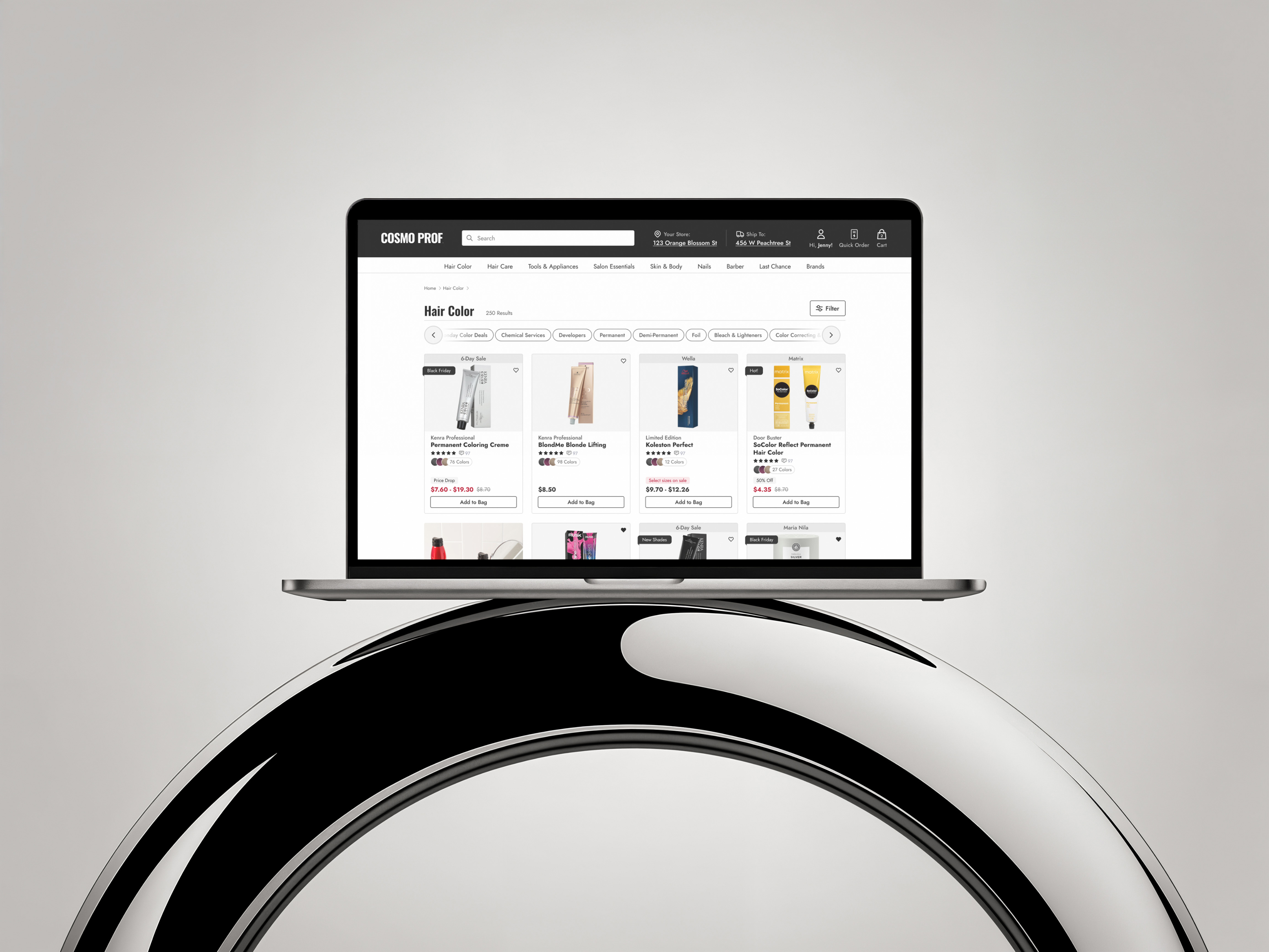
Our product listing page wasn’t just busy—it was screaming at users. Promotions dominated the product cards, while the filtering system was so overstuffed with options it felt more like reading legal fine print than shopping.
Shoppers didn’t need more noise—they needed focus.
My UX Role:
+ UI Design
+ User Flow
+ Prototyping
+ Usability Testing

Solving For:
+ An unintuitive filtering system
+ Wild promotion badging
+ Lackluster product cards
01.

Main Usability Concerns
+ Filter Overload: A wall of checkboxes, dropdowns, and jargon that left users overwhelmed instead of empowered. They were also a nightmare to tap with your thumb.
+ Promotions on Steroids: Almost every card was shouting about deals with a img badge in the top right corner. In the above example, they are all the same, making nothing truly special.
+ Decision Paralysis: Too many filter options without clear organization caused shoppers to freeze up or give up.
02.

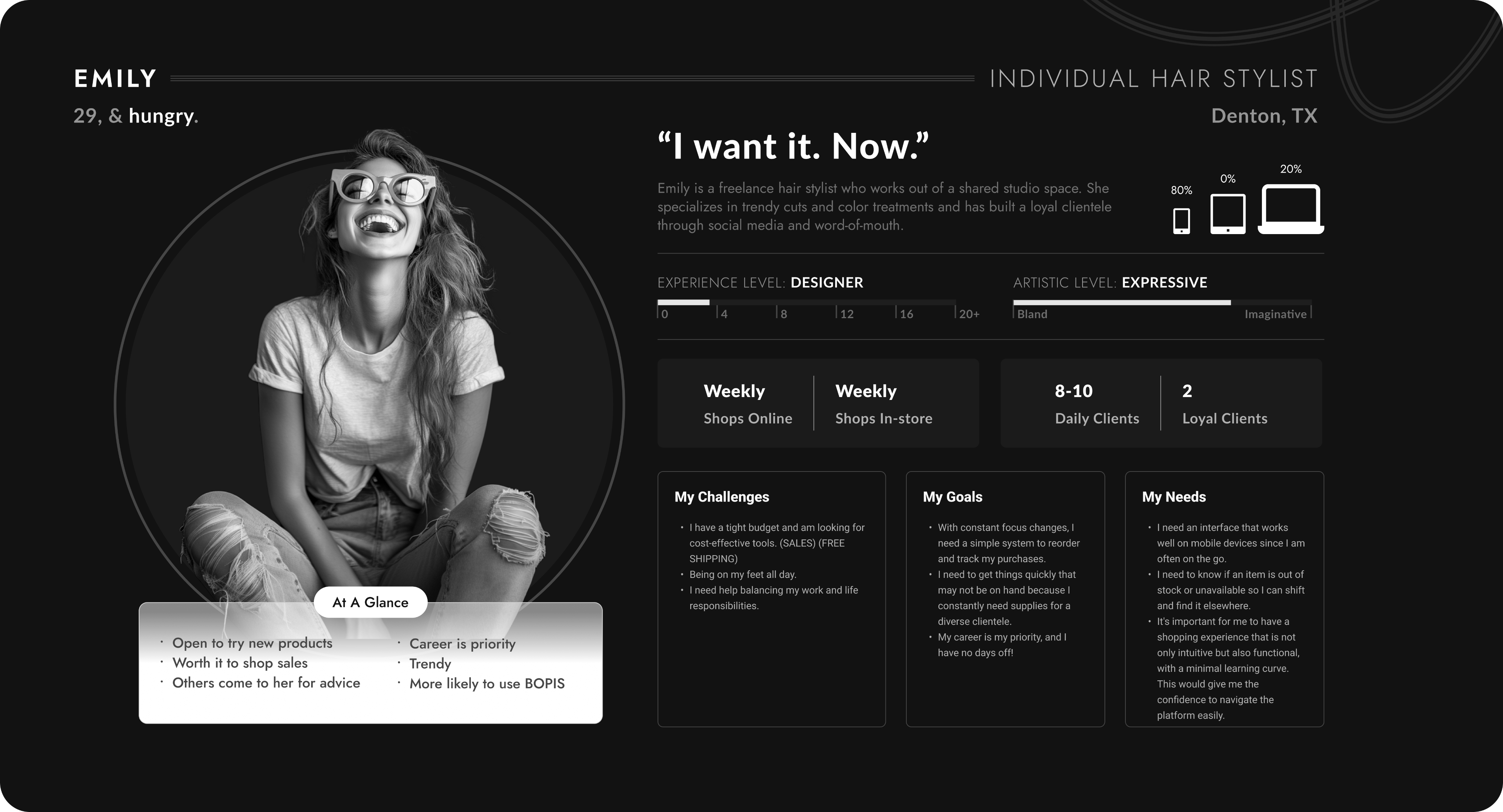
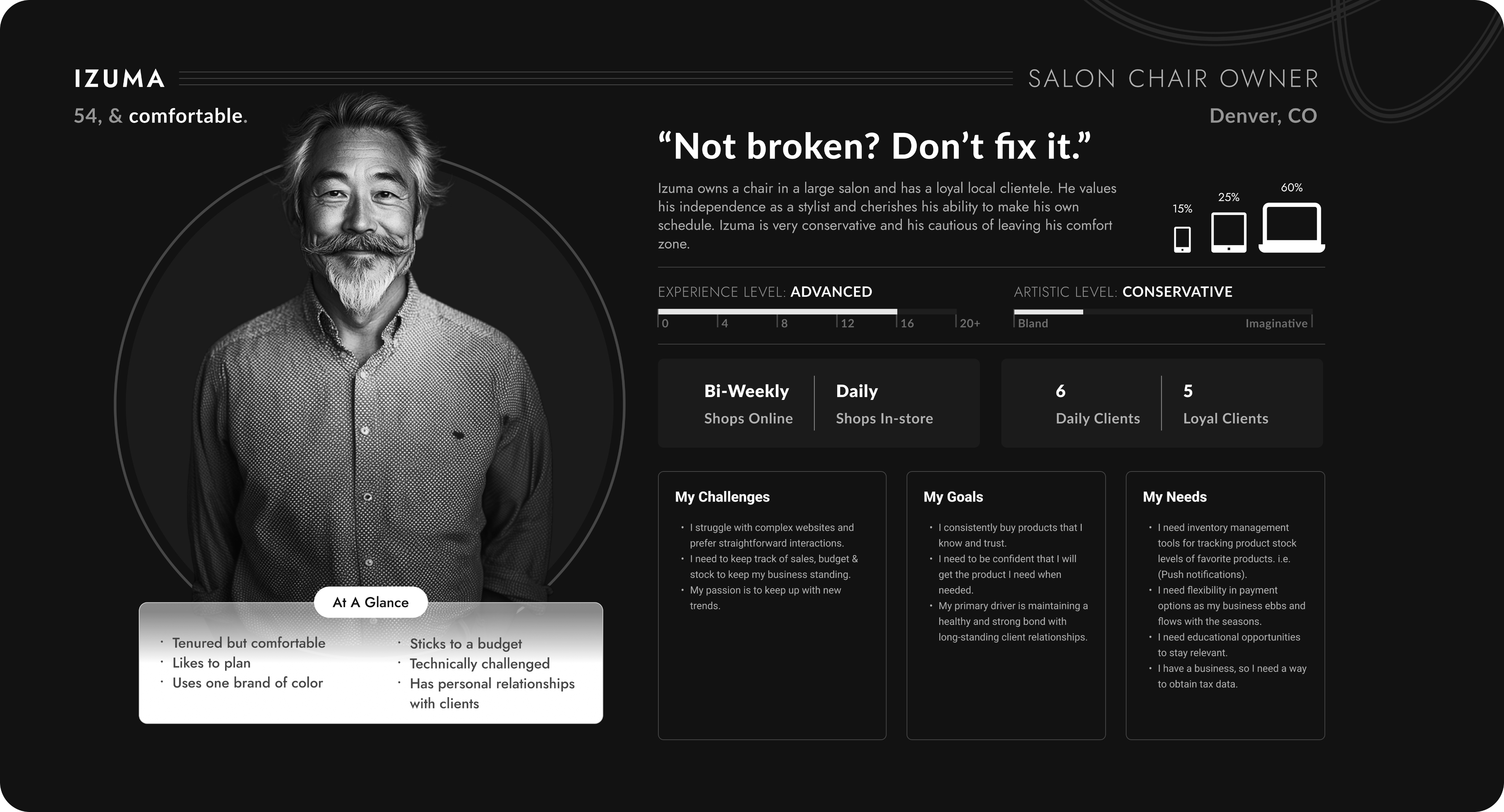
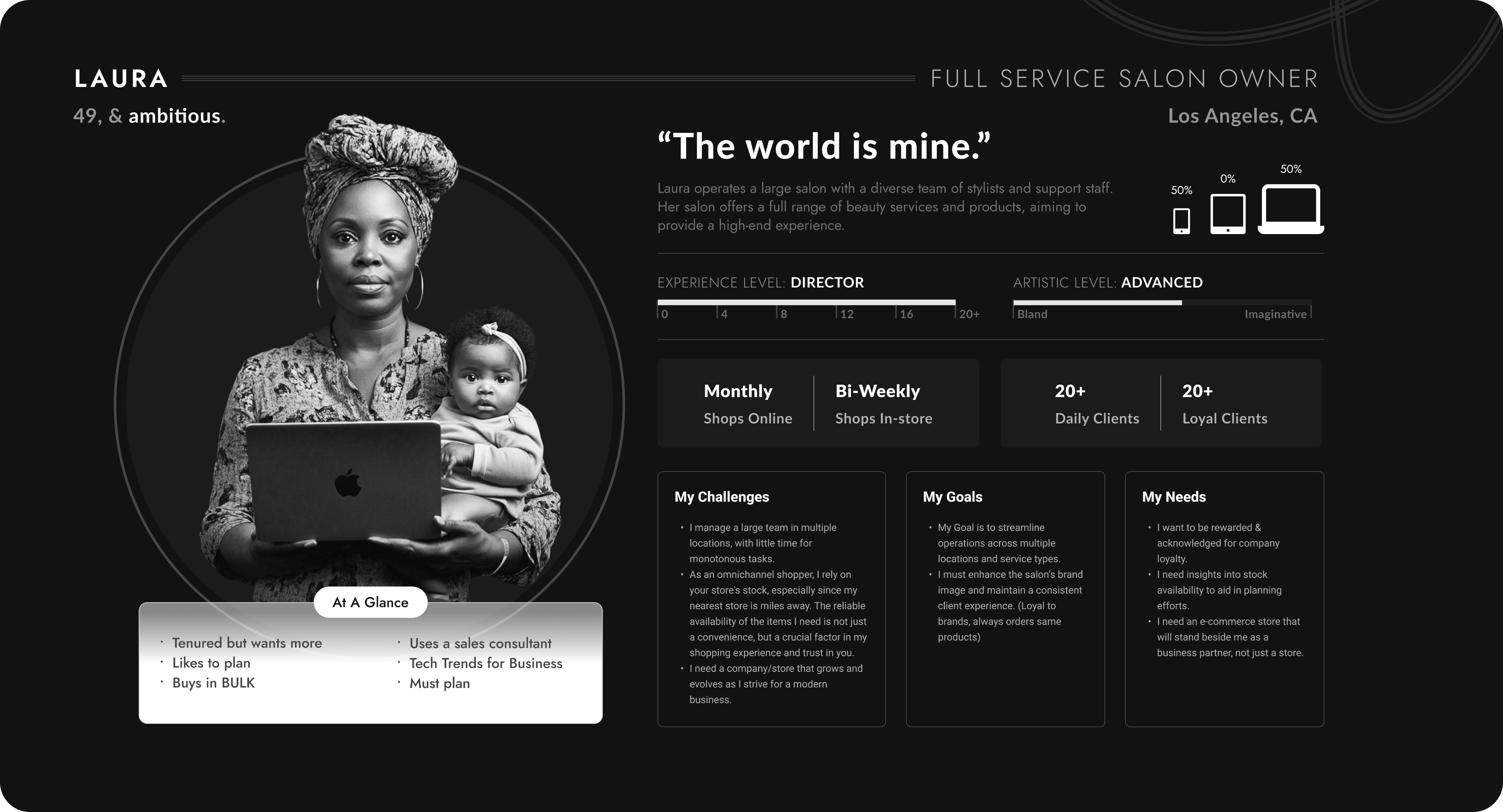
Say hello to my fabulous trio of users — the Stylist Sprint Queen, the Salon Owner with a loyalty card in one hand and a baby in the other, and the chair owner who doesn't like change.
These personas were crafted to bring real voices, goals, and frustrations into the design process. These personas were created using real data and countless user tests.
03.

New Product Card: Hello Tiered Badging
Of course for this part of the PLP redesign I wanted to make the product card more visually appealing and add a couple cool features - I did just that. But...Aside from the obvious glow-ups to the product card—like letting users heart items right from the PLP, actually showing how many color variants exist (because “surprise, there are six more shades” isn’t good UX), and giving the whole thing a cleaner look—I had to wrestle with the real beast: badging.
Here’s the backstory:
Every time a promotion came along, the business team would whip up a quirky PNG badge and slap it onto the product card. Different fonts, random colors, zero rules—like a sticker collection gone rogue. Over time, we’d built a chaotic library of untamed, clashing badges that did everything except fit our design system.
So the big question became: how do you tame the untamable?My answer: Tiered Badging.
I get it, it’s less fun, but, it’s more efficient. Now the ecommerce team will have badges they control from the backend with an established hierarchy and greater flexibility. Scalable solutions often require compromise.
04.

Now, Let’s Adress Filtering
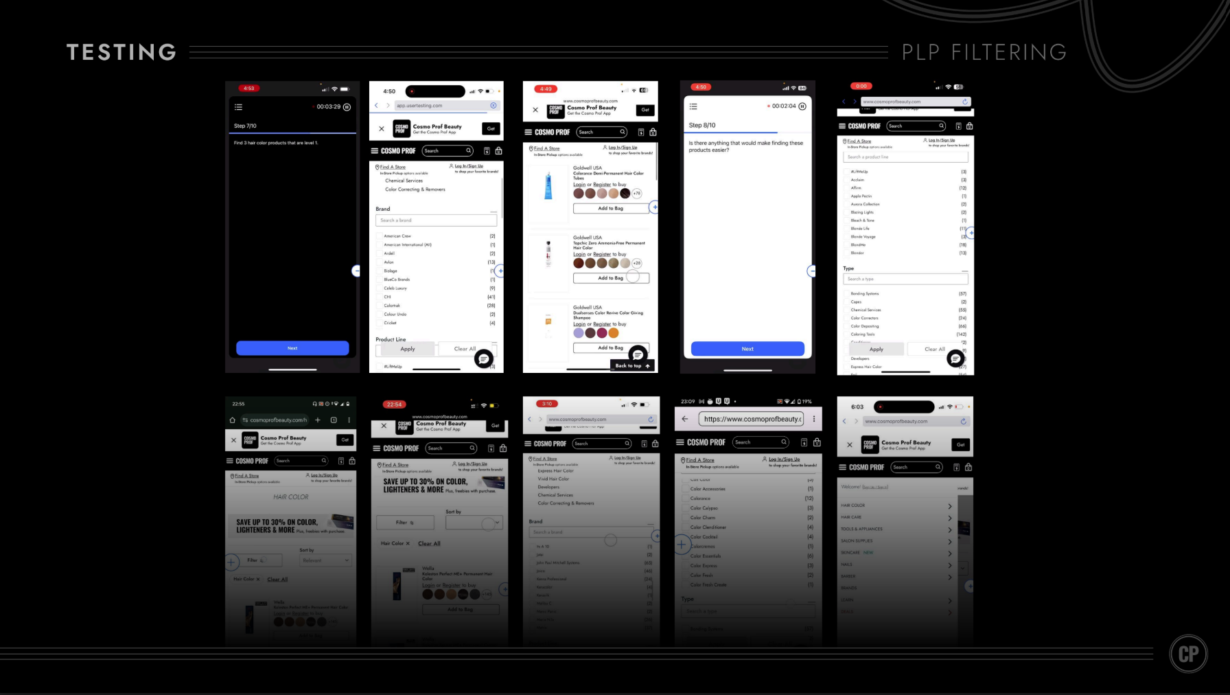
User Testing and Session Replays did an excellent job of revealing glaring UX pitfalls in the original filtering design.
Main Usability Concerns
+ Tiny touch targets: 80% of users are on mobile, but checkboxes were too small to tap accurately.
+ Checkbox vs. link confusion: Tapping the filter name (e.g., “American Crew”) didn’t select it — it hijacked you to a new PLP.
+ Category ≠ Filter: “Category” items were actually links to second-level PLPs, but looked just like normal filters
+ Filter overload: Dozens of filters, all expanded by default → instant cognitive overload.
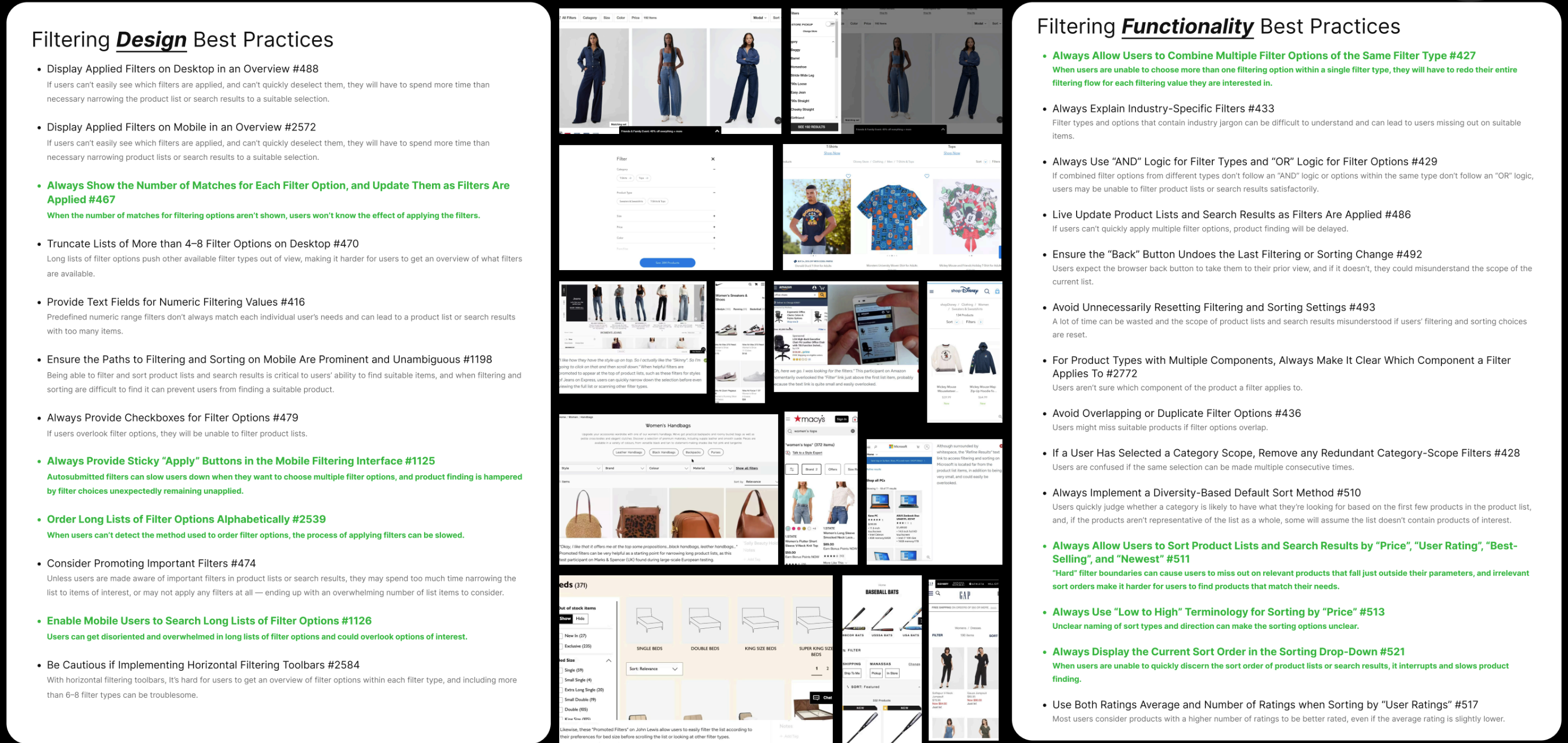
During a stakeholder presentation, I presented these findings to the team. I found best practices from the Baymard Institute that addressed filtering from the perspective of design and functionality respectively.
Everything highlighted in green is what Cosmo Prof was hitting the mark on. But as you can see, we still had many gaps to fill.
*Pro Tip: Every stakeholder meeting doesn’t have to be full of things that a company sucks at. Sometimes, it’s refreshing to let everyone know “Hey, we actually got some things right.”
After benchmarking, finding best practices, user testing, and other UX research I landed on a simple yet troubled diagnosis (user statement).
As A User,
Filtering in the PLP can be cumbersome and interruptive to my natural flow. Sifting through so many options is hard, and finding what I’ve previously selected is harder.
05.

Now, Let’s Adress Filtering
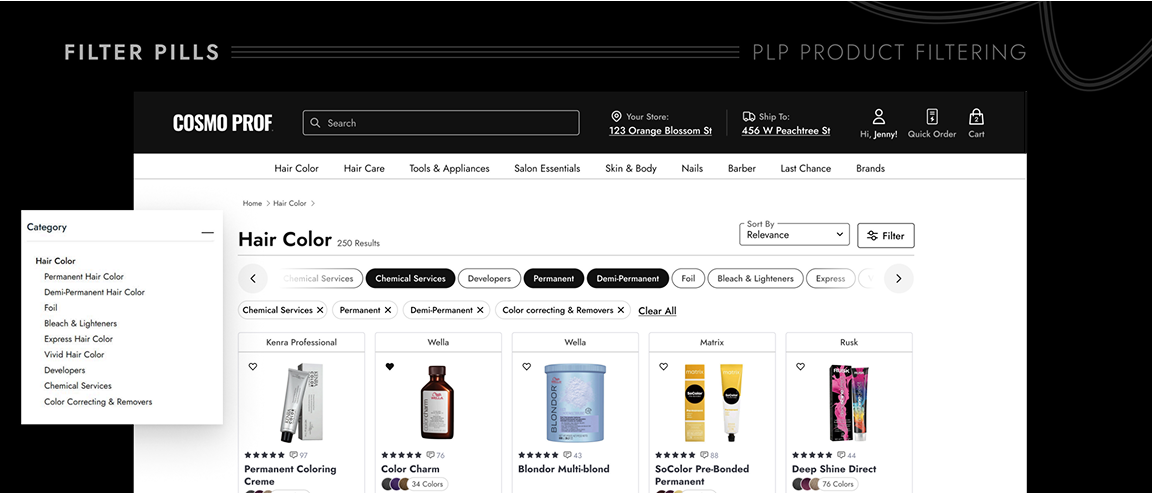
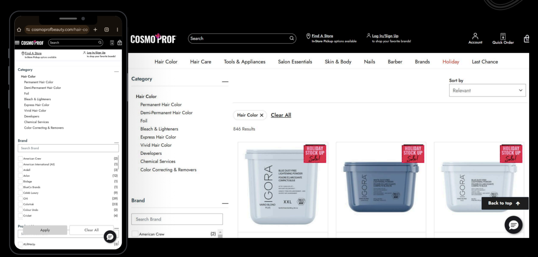
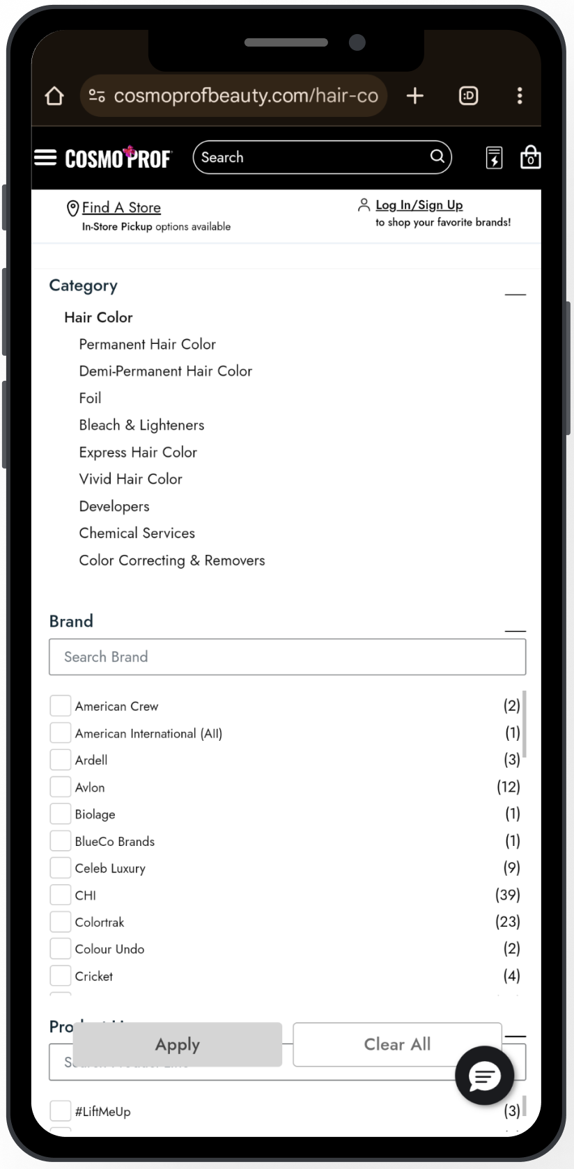
Remember those so-called “Category” filters that were actually links to second-level PLPs? Heatmaps showed they were by far the most clicked items in the panel. So I pulled them out of the clutter and promoted them to the top of the page as sleek quick-filter pills, while tucking the giant wall of “less-used” filters neatly behind a single Filter button. Cognitive overload: solved.
The screenshot above shows my first stab at it—not perfect. After some sharp feedback from devs and my brilliant UX Manager Emma Soto, we scrapped the idea of keeping pills in an “active” state. Instead, they now disappear once clicked, behaving more like the links they truly are. Cleaner, simpler, smarter.
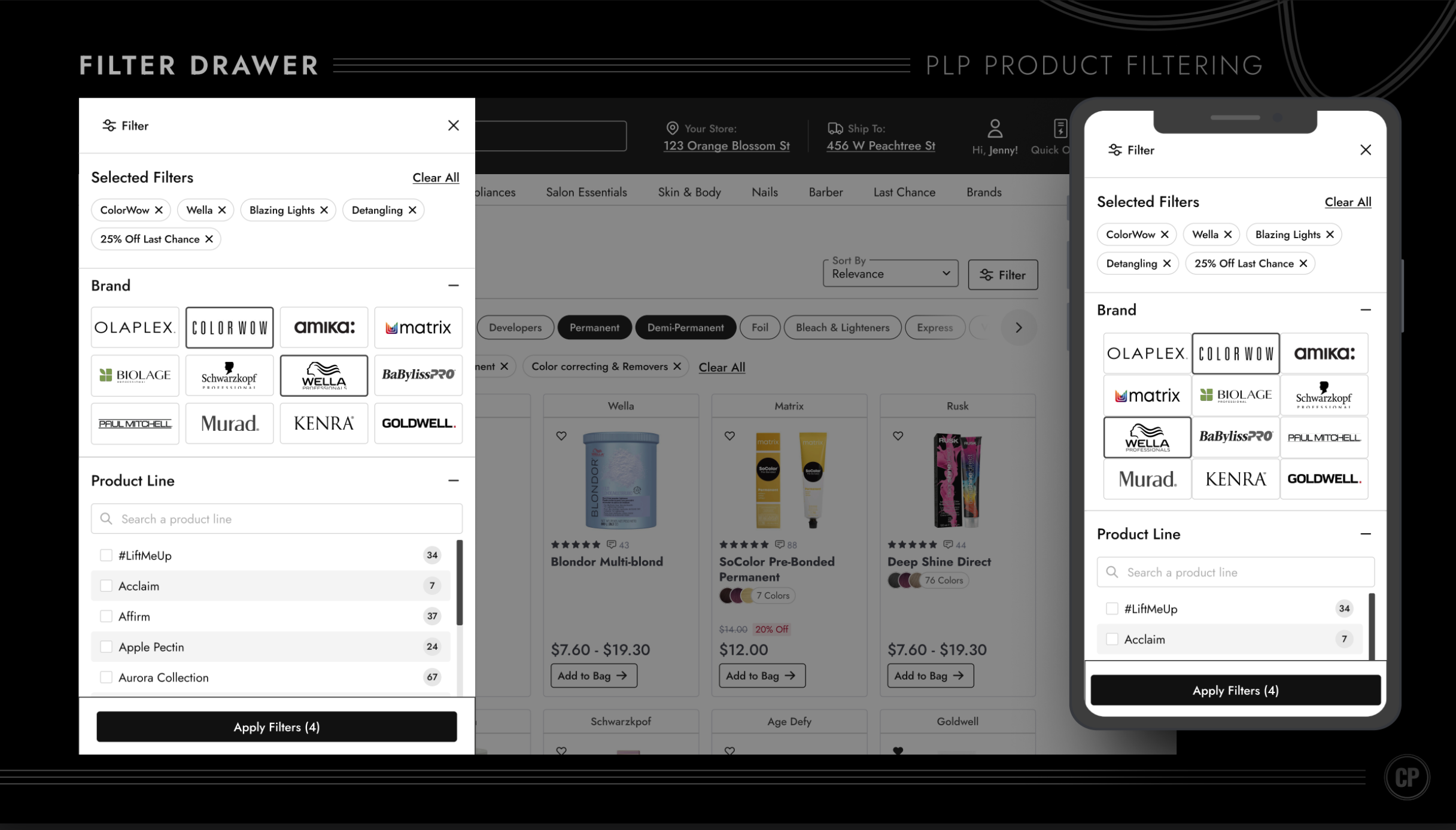
Clicking the Filter button in the top right now reveals a sleek new filter drawer—replacing the giant cluttered panel that used to hog the left side of the PLP.
This redesign solved major usability pain points, like tiny touch targets, and layered in thoughtful details: alternating gray backgrounds so users don’t lose their place, filter counts reintroduced as tidy badge components from our Design System, and filters collapsed by default to cut down on cognitive overload.
It wasn’t just about categories, either—brands were a big deal. Since logos are often more recognizable than names, we swapped plain text for brand logos, making it faster and easier for shoppers to find what they wanted. In testing, users loved this—many noted they “remember the logo, not the name.”

...we missed something.
Overall, this was a huge step forward for usability and visual clarity. But… it wasn’t perfect. User testing revealed one big missing piece: color filtering.
06.

User Testing
As I mentioned earlier, one big miss was color filtering. Since it was never part of the old left-side panel, it accidentally got left out of the redesign too. Oops. To validate how critical it really was, we put it in front of users during testing—and let them show us just how important color filtering is to the shopping experience.
KEY INSIGHT 1
“The filters in colors and levels, I think that's great. You should do that, that's, that's gonna make our lives easier.”
KEY INSIGHT 2
“I would definitely use the color filter because...I already have the color in mind.”
KEY INSIGHT 3
“My preference is looking for a color first instead of looking for brands...there's already a specific color that I have in mind....if the brand doesn't have the color available, then I would not be looking at that brand in the first place.”
KEY INSIGHT 4
“So when I'm shopping in the store, before I shop in the store, I'll search online, uh, and I kind of get some data and I'll have some idea about what color tone I would like to have.”
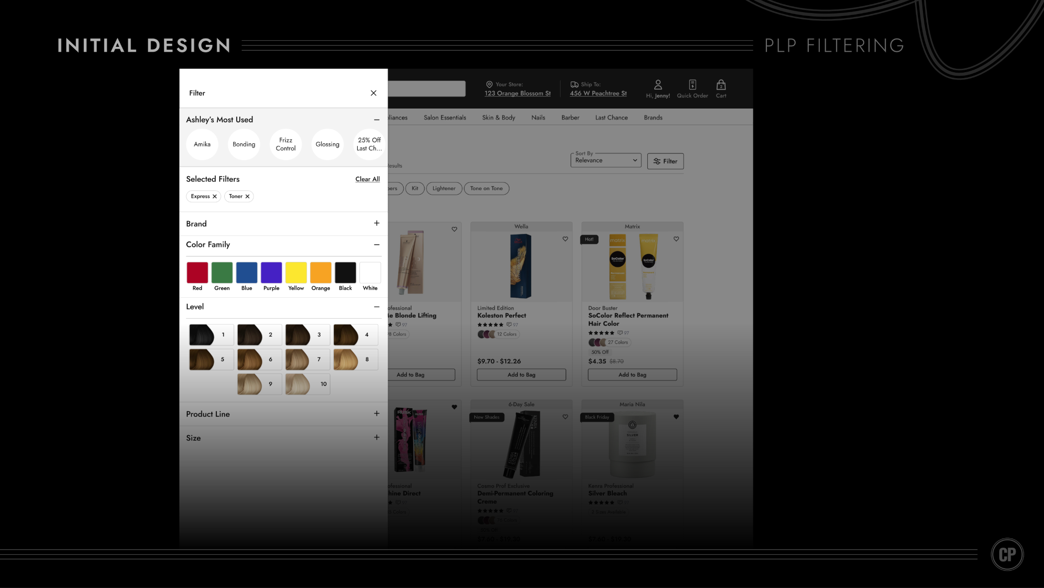
After several iterations, we landed on a clean, straightforward design. But here’s the nuance: our users aren’t typical shoppers—they’re licensed hair professionals (remember those personas from the start). For them, a basic color filter like “red, green, blue” doesn’t cut it. Pros think in terms of levels when it comes to hair shades, so I introduced a dedicated Level Filter (pictured above) to match their mental model.
You’ll also notice “Ashley’s Most Used” filters at the top. That year, the company was heavily focused on weaving personalization into the shopping experience. Knowing many pros return to reorder the same products, I designed a layer of personalized filters to make repeat purchasing faster and more intuitive.
07.

This project was both challenging and rewarding—absolutely worth it. This redesign drove a significant lift in average order value (AOV), a metric I’m proud to showcase front and center here in my portfolio. Proof that thoughtful design really does pay off.
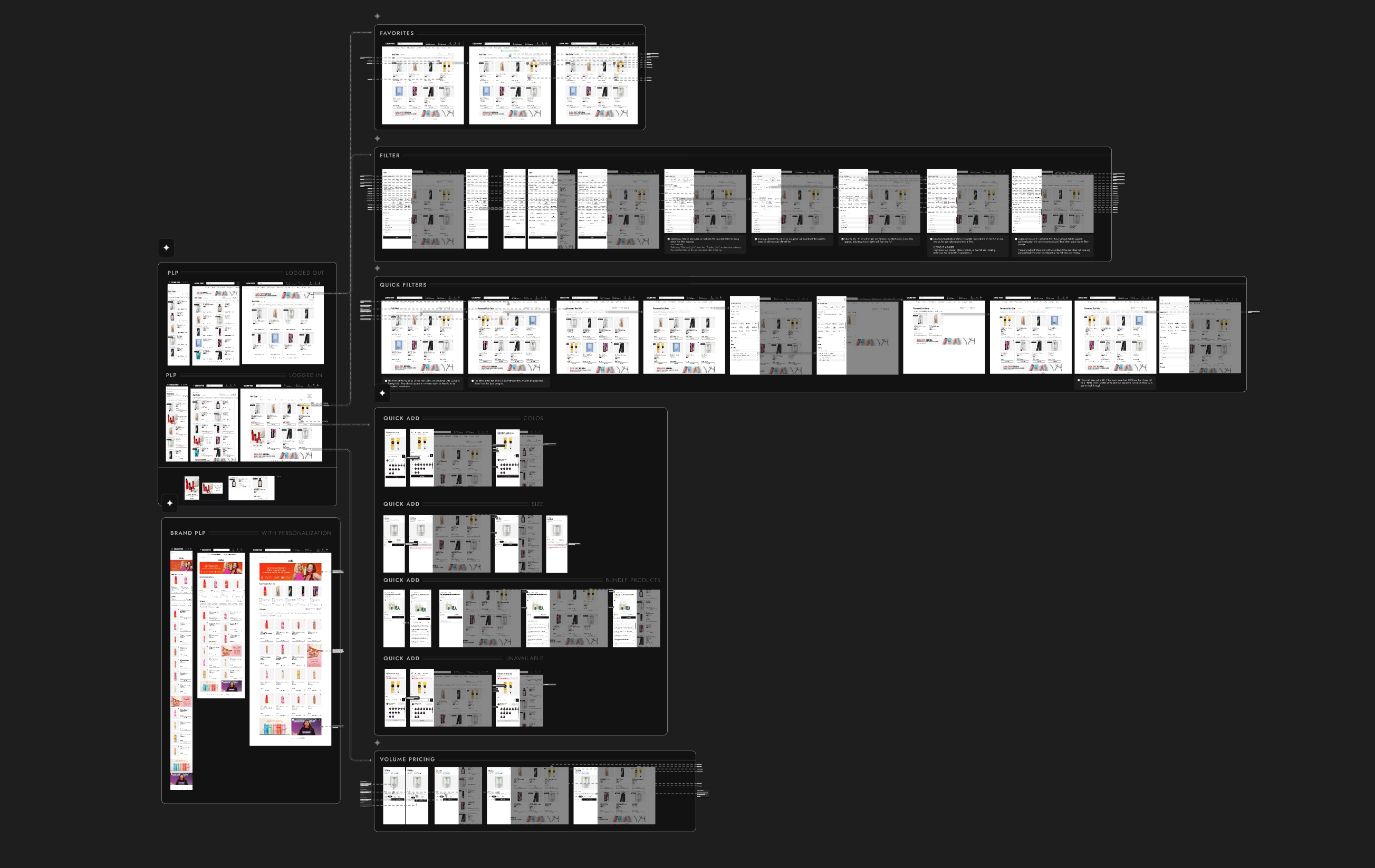
I’ve focused on the big-ticket initiatives in this PLP redesign, but there were plenty of additional details and features that I documented and handed off to the development team (as shown below).
Anyone claiming UX has no ROI… well, the numbers just called their bluff.
Good UX isn’t just pretty screens—it’s revenue in disguise.


Available for work
Clarity Over Clutter: Redesigning the Product Listing Page
Our product listing page wasn’t just busy—it was screaming at users. Promotions dominated the product cards, while the filtering system was so overstuffed with options it felt more like reading legal fine print than shopping.
Shoppers didn’t need more noise—they needed focus.
My UX Role:
+ UI Design
+ User Flow
+ Prototyping
+ Usability Testing
Solving For:
+ An unintuitive filtering system
+ Wild promotion badging
+ Lackluster product cards
01.

Main Usability Concerns
+ Filter Overload: A wall of checkboxes, dropdowns, and jargon that left users overwhelmed instead of empowered. They were also a nightmare to tap with your thumb.
+ Promotions on Steroids: Almost every card was shouting about deals with a img badge in the top right corner. In the above example, they are all the same, making nothing truly special.
+ Decision Paralysis: Too many filter options without clear organization caused shoppers to freeze up or give up.
02.

Say hello to my fabulous trio of users — the Stylist Sprint Queen, the Salon Owner with a loyalty card in one hand and a baby in the other, and the chair owner who doesn't like change.
These personas were crafted to bring real voices, goals, and frustrations into the design process. These personas were created using real data and countless user tests.
03.

New Product Card: Hello Tiered Badging
Of course for this part of the PLP redesign I wanted to make the product card more visually appealing and add a couple cool features - I did just that. But...Aside from the obvious glow-ups to the product card—like letting users heart items right from the PLP, actually showing how many color variants exist (because “surprise, there are six more shades” isn’t good UX), and giving the whole thing a cleaner look—I had to wrestle with the real beast: badging.
Here’s the backstory:
Every time a promotion came along, the business team would whip up a quirky PNG badge and slap it onto the product card. Different fonts, random colors, zero rules—like a sticker collection gone rogue. Over time, we’d built a chaotic library of untamed, clashing badges that did everything except fit our design system.
So the big question became: how do you tame the untamable?My answer: Tiered Badging.
I get it, it’s less fun, but, it’s more efficient. Now the ecommerce team will have badges they control from the backend with an established hierarchy and greater flexibility. Scalable solutions often require compromise.
04.

Now, Let’s Adress Filtering
User Testing and Session Replays did an excellent job of revealing glaring UX pitfalls in the original filtering design.
Main Usability Concerns
+ Tiny touch targets: 80% of users are on mobile, but checkboxes were too small to tap accurately.
+ Checkbox vs. link confusion: Tapping the filter name (e.g., “American Crew”) didn’t select it — it hijacked you to a new PLP.
+ Category ≠ Filter: “Category” items were actually links to second-level PLPs, but looked just like normal filters
+ Filter overload: Dozens of filters, all expanded by default → instant cognitive overload.
During a stakeholder presentation, I presented these findings to the team. I found best practices from the Baymard Institute that addressed filtering from the perspective of design and functionality respectively.
Everything highlighted in green is what Cosmo Prof was hitting the mark on. But as you can see, we still had many gaps to fill.
*Pro Tip: Every stakeholder meeting doesn’t have to be full of things that a company sucks at. Sometimes, it’s refreshing to let everyone know “Hey, we actually got some things right.”
After benchmarking, finding best practices, user testing, and other UX research I landed on a simple yet troubled diagnosis (user statement).
As A User,
Filtering in the PLP can be cumbersome and interruptive to my natural flow. Sifting through so many options is hard, and finding what I’ve previously selected is harder.
05.

Now, Let’s Adress Filtering
Remember those so-called “Category” filters that were actually links to second-level PLPs? Heatmaps showed they were by far the most clicked items in the panel. So I pulled them out of the clutter and promoted them to the top of the page as sleek quick-filter pills, while tucking the giant wall of “less-used” filters neatly behind a single Filter button. Cognitive overload: solved.
The screenshot above shows my first stab at it—not perfect. After some sharp feedback from devs and my brilliant UX Manager Emma Soto, we scrapped the idea of keeping pills in an “active” state. Instead, they now disappear once clicked, behaving more like the links they truly are. Cleaner, simpler, smarter.
Clicking the Filter button in the top right now reveals a sleek new filter drawer—replacing the giant cluttered panel that used to hog the left side of the PLP.
This redesign solved major usability pain points, like tiny touch targets, and layered in thoughtful details: alternating gray backgrounds so users don’t lose their place, filter counts reintroduced as tidy badge components from our Design System, and filters collapsed by default to cut down on cognitive overload.
It wasn’t just about categories, either—brands were a big deal. Since logos are often more recognizable than names, we swapped plain text for brand logos, making it faster and easier for shoppers to find what they wanted. In testing, users loved this—many noted they “remember the logo, not the name.”
...we missed something.
Overall, this was a huge step forward for usability and visual clarity. But… it wasn’t perfect. User testing revealed one big missing piece: color filtering.
06.

User Testing
As I mentioned earlier, one big miss was color filtering. Since it was never part of the old left-side panel, it accidentally got left out of the redesign too. Oops. To validate how critical it really was, we put it in front of users during testing—and let them show us just how important color filtering is to the shopping experience.
KEY INSIGHT 1
“The filters in colors and levels, I think that's great. You should do that, that's, that's gonna make our lives easier.”
KEY INSIGHT 2
“I would definitely use the color filter because...I already have the color in mind.”
KEY INSIGHT 3
“My preference is looking for a color first instead of looking for brands...there's already a specific color that I have in mind....if the brand doesn't have the color available, then I would not be looking at that brand in the first place.”
KEY INSIGHT 4
“So when I'm shopping in the store, before I shop in the store, I'll search online, uh, and I kind of get some data and I'll have some idea about what color tone I would like to have.”
After several iterations, we landed on a clean, straightforward design. But here’s the nuance: our users aren’t typical shoppers—they’re licensed hair professionals (remember those personas from the start). For them, a basic color filter like “red, green, blue” doesn’t cut it. Pros think in terms of levels when it comes to hair shades, so I introduced a dedicated Level Filter (pictured above) to match their mental model.
You’ll also notice “Ashley’s Most Used” filters at the top. That year, the company was heavily focused on weaving personalization into the shopping experience. Knowing many pros return to reorder the same products, I designed a layer of personalized filters to make repeat purchasing faster and more intuitive.
07.

This project was both challenging and rewarding—absolutely worth it. This redesign drove a significant lift in average order value (AOV), a metric I’m proud to showcase front and center here in my portfolio. Proof that thoughtful design really does pay off.
I’ve focused on the big-ticket initiatives in this PLP redesign, but there were plenty of additional details and features that I documented and handed off to the development team (as shown below).
Anyone claiming UX has no ROI… well, the numbers just called their bluff.
Good UX isn’t just pretty screens—it’s revenue in disguise.


Available for work
Clarity Over Clutter: Redesigning the Product Listing Page
Our product listing page wasn’t just busy—it was screaming at users. Promotions dominated the product cards, while the filtering system was so overstuffed with options it felt more like reading legal fine print than shopping.
Shoppers didn’t need more noise—they needed focus.
My UX Role:
+ UI Design
+ User Flow
+ Prototyping
+ Usability Testing

Solving For:
+ An unintuitive filtering system
+ Lackluster product cards
+ Wild promotion badging
01.

Main Usability Concerns
+ Filter Overload: A wall of checkboxes, dropdowns, and jargon that left users overwhelmed instead of empowered. They were also a nightmare to tap with your thumb.
+ Promotions on Steroids: Almost every card was shouting about deals with a img badge in the top right corner. In the above example, they are all the same, making nothing truly special.
+ Decision Paralysis: Too many filter options without clear organization caused shoppers to freeze up or give up.
02.

Say hello to my fabulous trio of users — the Stylist Sprint Queen, the Salon Owner with a loyalty card in one hand and a baby in the other, and the chair owner who doesn't like change.
These personas were crafted to bring real voices, goals, and frustrations into the design process. These personas were created using real data and countless user tests.
03.

New Product Card: Hello Tiered Badging
Of course for this part of the PLP redesign I wanted to make the product card more visually appealing and add a couple cool features - I did just that. But...Aside from the obvious glow-ups to the product card—like letting users heart items right from the PLP, actually showing how many color variants exist (because “surprise, there are six more shades” isn’t good UX), and giving the whole thing a cleaner look—I had to wrestle with the real beast: badging.
Here’s the backstory:
Every time a promotion came along, the business team would whip up a quirky PNG badge and slap it onto the product card. Different fonts, random colors, zero rules—like a sticker collection gone rogue. Over time, we’d built a chaotic library of untamed, clashing badges that did everything except fit our design system.
So the big question became: how do you tame the untamable?My answer: Tiered Badging.
I get it, it’s less fun, but, it’s more efficient. Now the ecommerce team will have badges they control from the backend with an established hierarchy and greater flexibility. Scalable solutions often require compromise.
04.

Now, Let’s Address Filtering
User Testing and Session Replays did an excellent job of revealing glaring UX pitfalls in the original filtering design.
Main Usability Concerns
+ Tiny touch targets: 80% of users are on mobile, but checkboxes were too small to tap accurately.
+ Checkbox vs. link confusion: Tapping the filter name (e.g., “American Crew”) didn’t select it — it hijacked you to a new PLP.
+ Category ≠ Filter: “Category” items were actually links to second-level PLPs, but looked just like normal filters
+ Filter overload: Dozens of filters, all expanded by default → instant cognitive overload.
During a stakeholder presentation, I presented these findings to the team. I found best practices from the Baymard Institute that addressed filtering from the perspective of design and functionality respectively.
Everything highlighted in green is what Cosmo Prof was hitting the mark on. But as you can see, we still had many gaps to fill.
*Pro Tip: Every stakeholder meeting doesn’t have to be full of things that a company sucks at. Sometimes, it’s refreshing to let everyone know “Hey, we actually got some things right.”
After benchmarking, finding best practices, user testing, and other UX research I landed on a simple yet troubled diagnosis (user statement).
As A User,
Filtering in the PLP can be cumbersome and interruptive to my natural flow. Sifting through so many options is hard, and finding what I’ve previously selected is harder.
05.

Let’s try something different
Remember those so-called “Category” filters that were actually links to second-level PLPs? Heatmaps showed they were by far the most clicked items in the panel. So I pulled them out of the clutter and promoted them to the top of the page as sleek quick-filter pills, while tucking the giant wall of “less-used” filters neatly behind a single Filter button. Cognitive overload: solved.
The screenshot above shows my first stab at it—not perfect. After some sharp feedback from devs and my brilliant UX Manager Emma Soto, we scrapped the idea of keeping pills in an “active” state. Instead, they now disappear once clicked, behaving more like the links they truly are. Cleaner, simpler, smarter.
Clicking the Filter button in the top right now reveals a sleek new filter drawer—replacing the giant cluttered panel that used to hog the left side of the PLP.
This redesign solved major usability pain points, like tiny touch targets, and layered in thoughtful details: alternating gray backgrounds so users don’t lose their place, filter counts reintroduced as tidy badge components from our Design System, and filters collapsed by default to cut down on cognitive overload.
It wasn’t just about categories, either—brands were a big deal. Since logos are often more recognizable than names, we swapped plain text for brand logos, making it faster and easier for shoppers to find what they wanted. In testing, users loved this—many noted they “remember the logo, not the name.”
...we missed something.
Overall, this was a huge step forward for usability and visual clarity. But… it wasn’t perfect. User testing revealed one big missing piece: color filtering.
06.

User Testing
As I mentioned earlier, one big miss was color filtering. Since it was never part of the old left-side panel, it accidentally got left out of the redesign too. Oops. To validate how critical it really was, we put it in front of users during testing—and let them show us just how important color filtering is to the shopping experience.
KEY INSIGHT 1
“The filters in colors and levels, I think that's great. You should do that, that's, that's gonna make our lives easier.”
KEY INSIGHT 2
“I would definitely use the color filter because...I already have the color in mind.”
KEY INSIGHT 3
“My preference is looking for a color first instead of looking for brands...there's already a specific color that I have in mind....if the brand doesn't have the color available, then I would not be looking at that brand in the first place.”
KEY INSIGHT 4
“So when I'm shopping in the store, before I shop in the store, I'll search online, uh, and I kind of get some data and I'll have some idea about what color tone I would like to have.”
After several iterations, we landed on a clean, straightforward design. But here’s the nuance: our users aren’t typical shoppers—they’re licensed hair professionals (remember those personas from the start). For them, a basic color filter like “red, green, blue” doesn’t cut it. Pros think in terms of levels when it comes to hair shades, so I introduced a dedicated Level Filter (pictured above) to match their mental model.
You’ll also notice “Ashley’s Most Used” filters at the top. That year, the company was heavily focused on weaving personalization into the shopping experience. Knowing many pros return to reorder the same products, I designed a layer of personalized filters to make repeat purchasing faster and more intuitive.
07.

This project was both challenging and rewarding—absolutely worth it. This redesign drove a significant lift in average order value (AOV), a metric I’m proud to showcase front and center here in my portfolio. Proof that thoughtful design really does pay off.
I’ve focused on the big-ticket initiatives in this PLP redesign, but there were plenty of additional details and features that I documented and handed off to the development team (as shown below).
Anyone claiming UX has no ROI… well, the numbers just called their bluff.
Good UX isn’t just pretty screens—it’s revenue in disguise.


How I decreased cart abandonment by 54%
view case study
↗
How I brought a Design System to maturity
view case study
↗