Available for work
"Buy One Get One Free"—sounds simple, right?
Promos like “Buy One Get One free” should feel like winning a mini game show—you play, you win, you get a prize.
Unfortunately, it wasn’t that simple on Cosmo Prof. The rules changed depending on the promo, and the interface wasn’t spilling the tea. Confused customers, abandoned carts, and missed sales? Not exactly the vibe we were going for.
My UX Role:
+ UI Design
+ User Flow
+ Prototyping
+ Usability Testing

Solving For:
+ High cart abandonment during GWP (Gift With Purchase) promotions
+ Frequent support tickets
+ Frustrated customers—and frustrated internal teams
01.


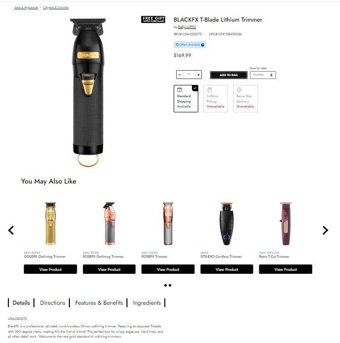
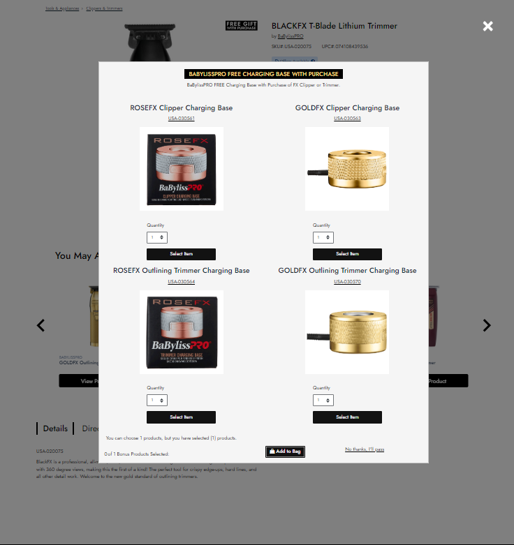
In the above example, a user triggered the “Free Gift with Purchase” modal by adding an eligible item to their shopping bag.
Main Usability Concerns
+ Users are immediately met with duplicate language at the top of the modal
+ Each massive product image is accompanied with a primary button larger than the actual “Add To Bag” button.
+ The opt-out button “No thanks, I’ll pass” is a small link with discoverability concerns.
+ The language “You can choose 1 products, but you have (1) products. 0 of 1 Bonus Products Selected:” is extremely confusing. No wonder users complained about this experience.
+ It’s clear that this modal will burst if there are anymore than 4 items, it’s inflexible.
02.

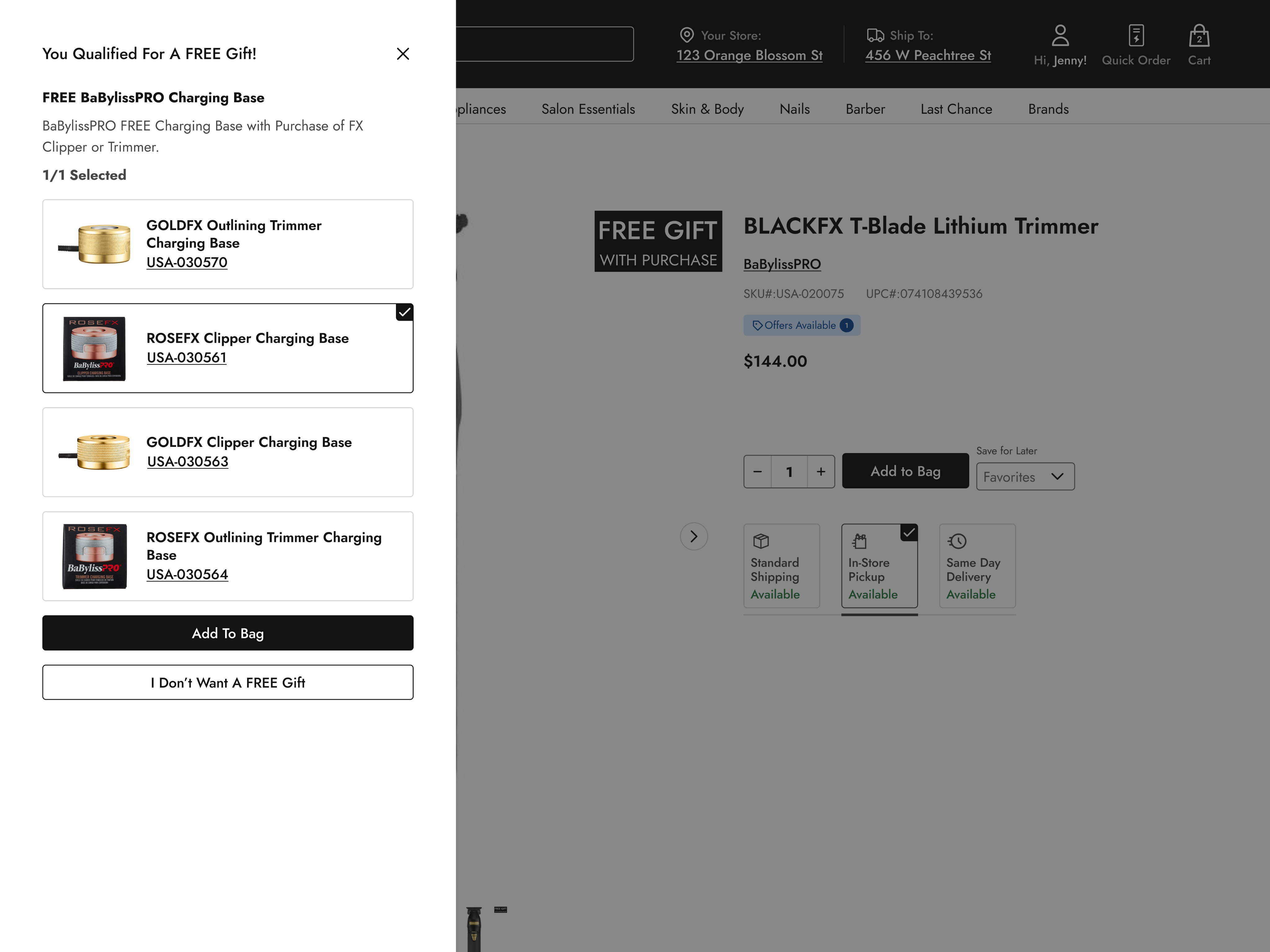
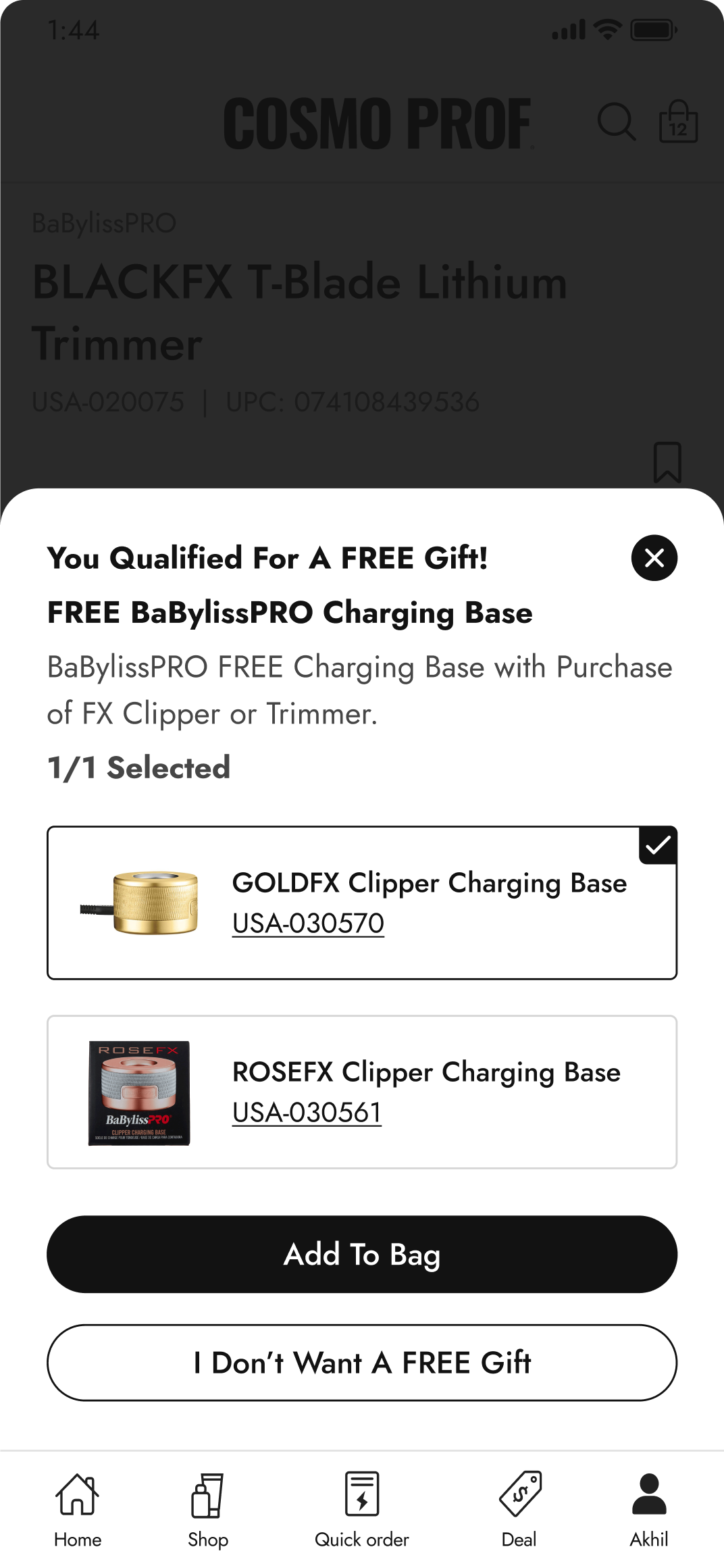
My team and I agreed that I should evolve the modal to a cleaner and more succinct drawer experience.
Distinct Advantages
+ It was perfect for the app - the drawer converts to mobile extremely well. This is important because 80% of Cosmo Prof customers are mobile users.
+ I decided to make the products into tappable tiles. With a clear selection state, there was no need for a gigantic primary “Select” button.
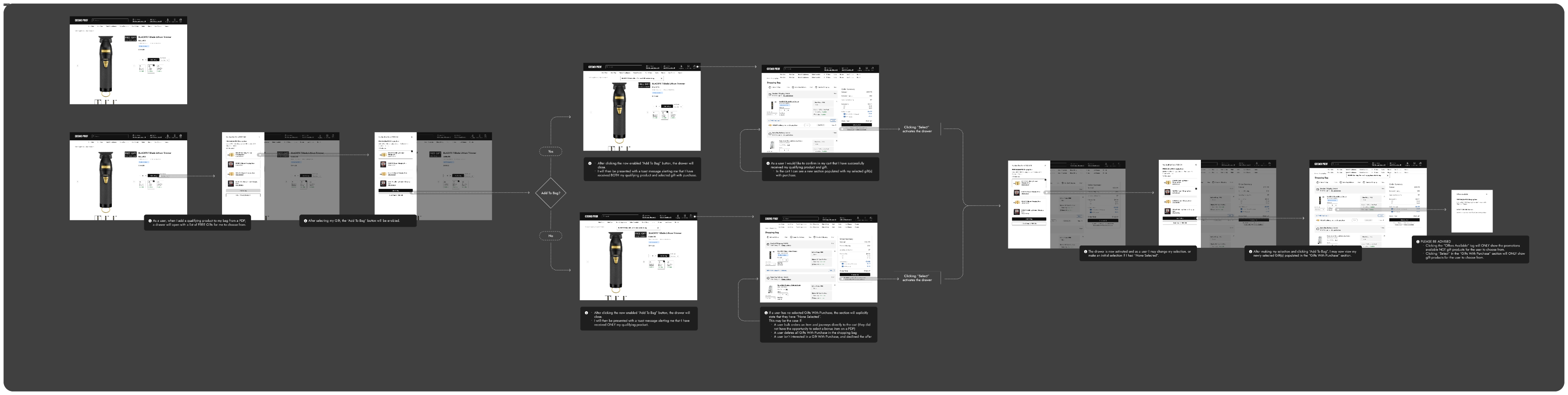
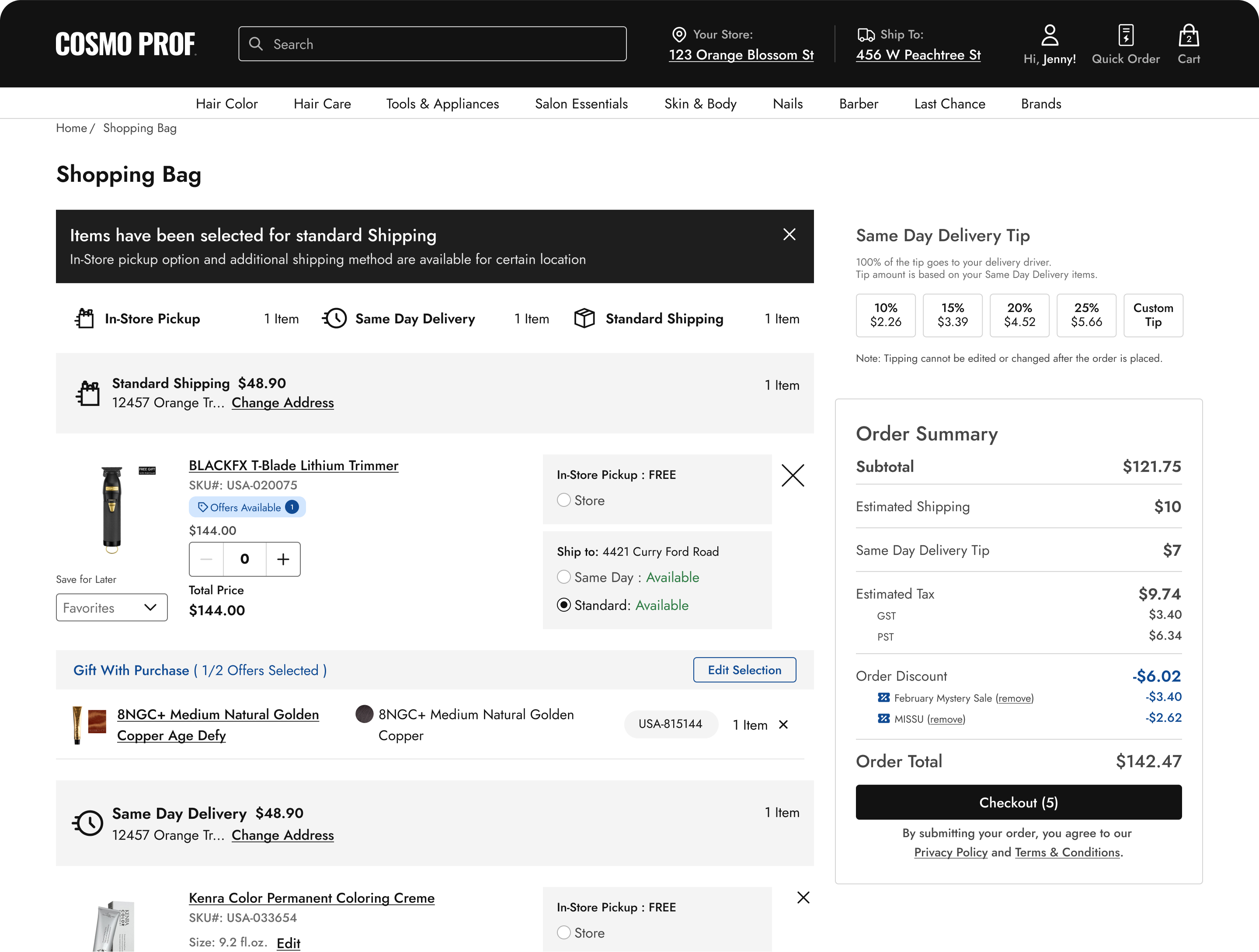
Though users select the GWP (Gift With Purchase) on the PDP (Product Description Page), that is not the GWP’s last appearance.
It is important that users can clearly see the free gifts they chose in the bag prior to checkout! As well as have the ability to edit the selection of gifts they chose on the PDP.
03.

Validation through unmoderated testing
After building out a couple Figma prototypes, I set up an A/B test in UserTesting.com. This A/B test was meant to test multiple versions (with slight selection variations) of the new GWP drawer experience. This mobile test included 6 users.
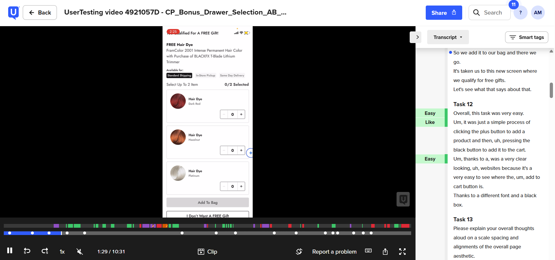
USER 1
“I think it would've made it easier if I'd just been able to click the ‘add to bag’ without having to add the number in.”
USER 2
“Overall this was very easy.”
USER 3
“I see the free gift with purchase and I also see that there's one offer available. Looks to be in the same place that the other one was...yes, so I definitely see that.”
USER 4
“...this was done very easily, thanks to just very clear and readable buttons...they were not obscured, they were not hard to find.”
USER 5
“It was easy to select and both understand why it was offering me these three items and to select between the three.”
USER 6
“There's just so many words on the screen - and all I wanna do is buy this one thing.”
Overall Sentiment
Most found the experience pretty painless and clear. Which is the exact opposite of the original GWP experience. Both the Product and Marketing team were really excited to ship this feature.
Though users thought the overall experience was intuitive, they provided valuable candid feedback as featured above.
04.

At this point, the project felt like a Netflix series

Just when you think it’s the finale, another season would drop. Turns out this roller coaster had a surprise loop. Hands back in the air, we weren’t done yet.
Here is a quick look at work from additional product requirements that continued to come in, and candidly, things our team missed. We call these “gotchas.” In consideration for the length of this case study, I will only include 3 “gotcha” moments.
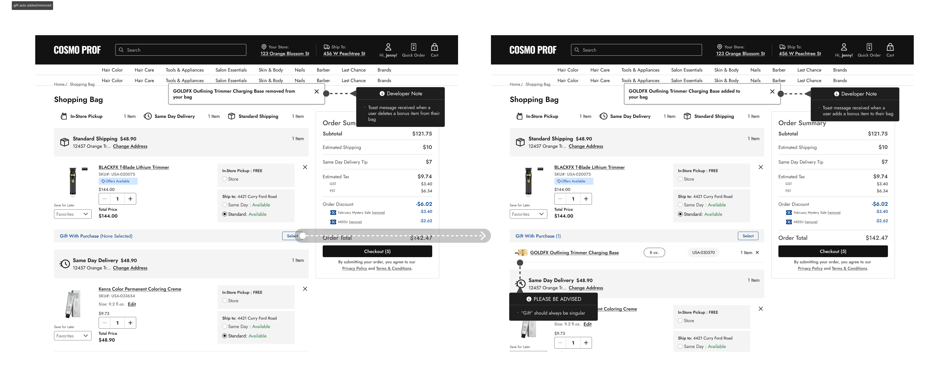
Use Case: Single Bonus Product Auto-Added/Removed
Usually, our promos come with a mini buffet of gift options—justifying a drawer or modal so users can pick their favorite. But what happens when there’s just one lonely little gift on the table?
After a few rounds of respectful ping-pong with the product team, we landed on a smoother, less-in-your-face solution: skip the drawer entirely. So now, when a user taps “Select,” the solo gift graciously hops into their bag—no extra clicks, no awkward pauses, just efficient gifting.
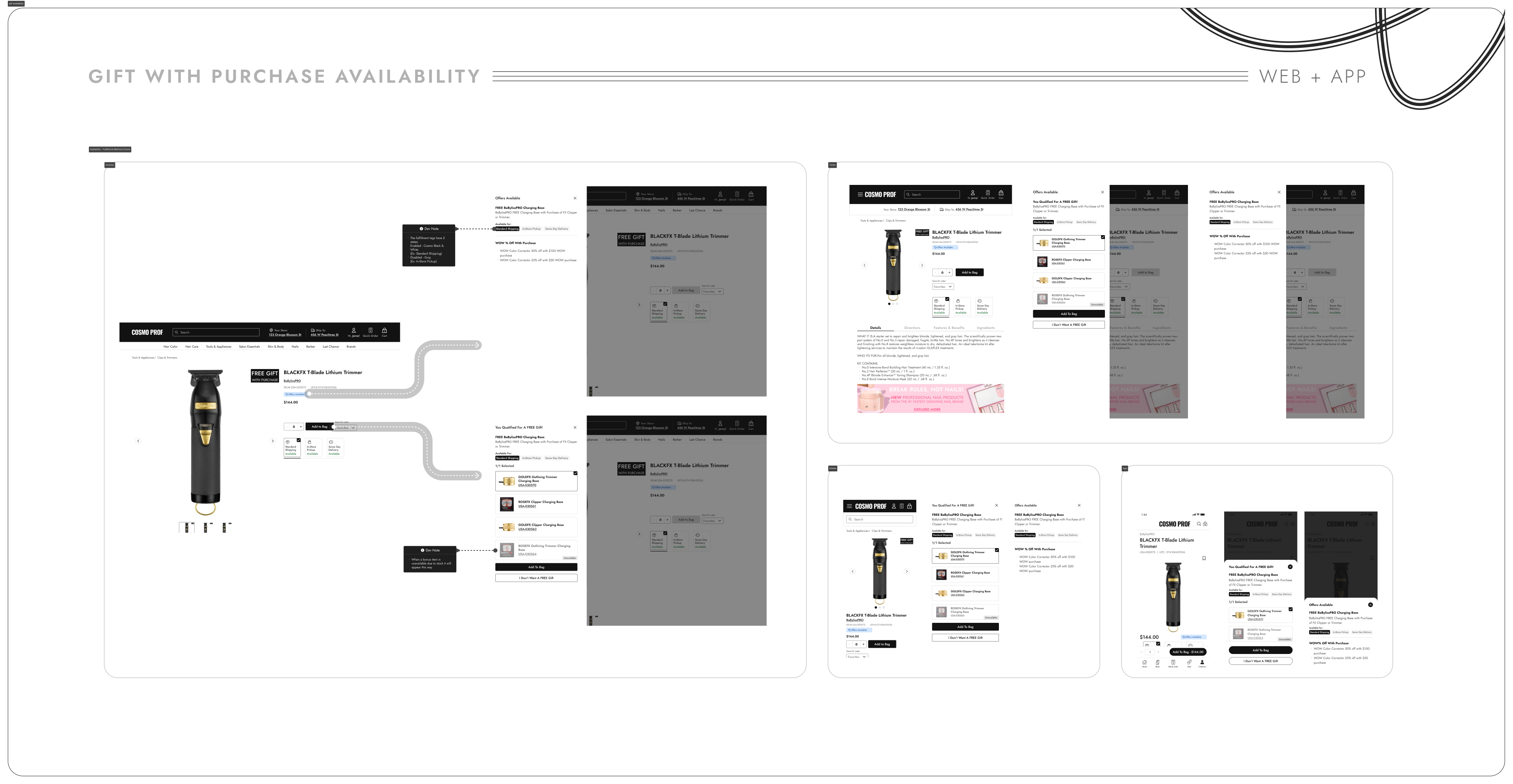
Use Case: A GWP Is temporarily out of stock
Sometimes, a gift with purchase is so popular it vanishes faster than the last donut in the break room. But just because it’s temporarily out of stock doesn’t mean we want to pretend it never existed.
Instead of pulling a disappearing act, we keep the gift visible—grayed out, yes, but proudly on display. It’s our way of saying, “Hey, we did want to give you this awesome thing… and we will again soon!” Transparency? Check. FOMO? Mildly intentional.
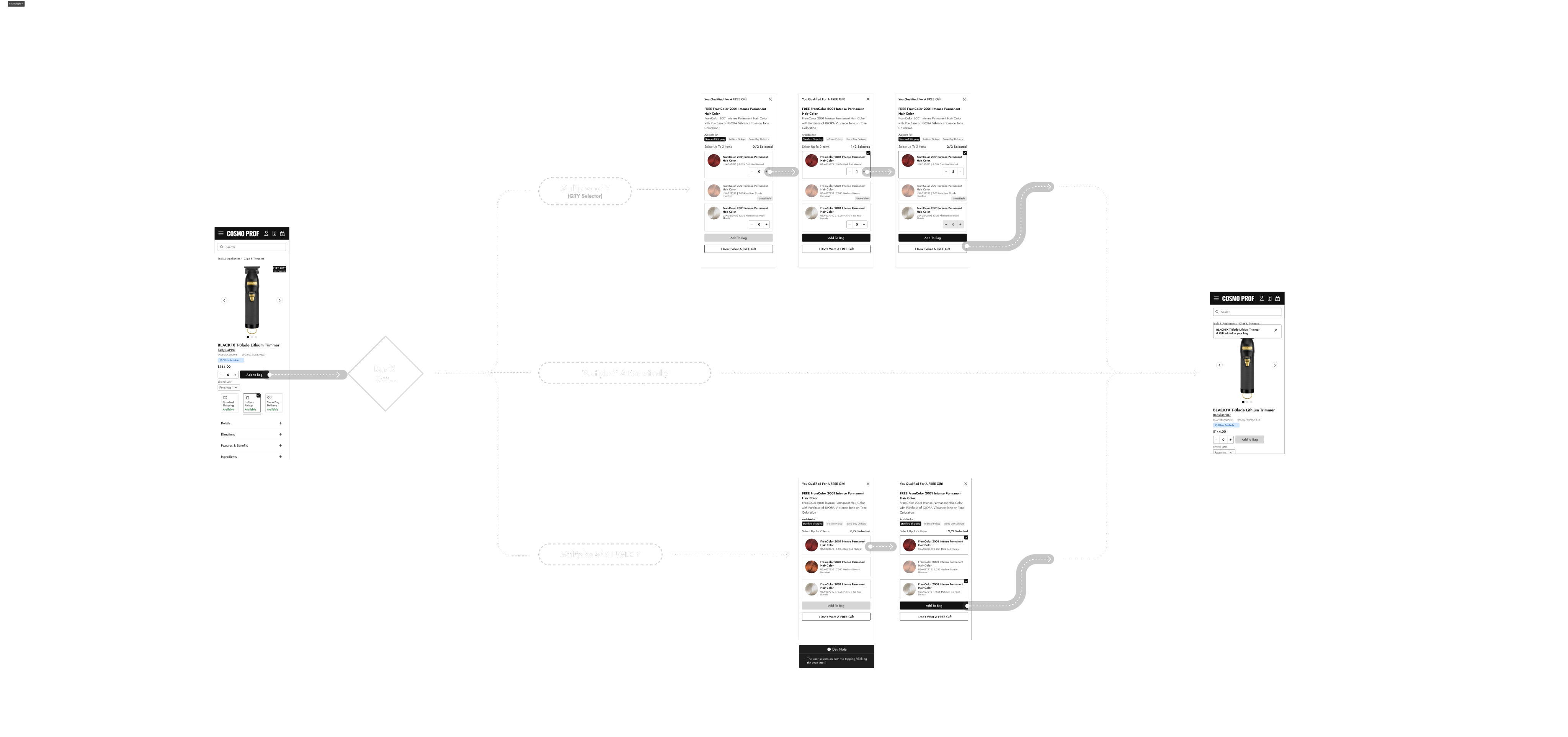
Use Case: (1 List) Buy X get Multiple Y
Why settle for just one freebie when you’ve earned a little extra? We realized users might want a sampler platter—maybe one of each gift, or maybe just two of their favorite (because backups are a thing).
So instead of forcing a single choice, we opened things up. Two gifts, any combo. Same item twice? Go for it. One of each? Love that journey for you. As long as the total doesn’t exceed the limit, it’s your gift game, your rules.
05.


This project spanned across multiple quarters in the fiscal year. It was truly a long ride, and truly worth it. The impact says it all.
54%
reduction in abandoned carts during GWP promotions.
Zero
customer complaints post-launch (compared to dozens weekly before)
Sharp
drop in support tickets related to promotions.
Improved
internal confidence in running more complex promotional campaigns.


Available for work
"Buy One Get One Free"—sounds simple, right?
Promos like “Buy One Get One free” should feel like winning a mini game show—you play, you win, you get a prize.
Unfortunately, it wasn’t that simple on Cosmo Prof. The rules changed depending on the promo, and the interface wasn’t spilling the tea. Confused customers, abandoned carts, and missed sales? Not exactly the vibe we were going for.
My UX Role:
+ UI Design
+ User Flow
+ Prototyping
+ Usability Testing
Solving For:
+ High cart abandonment during GWP (Gift With Purchase) promotions
+ Frequent support tickets
+ Frustrated customers—and frustrated internal teams
01.

In the above example, a user triggered the “Free Gift with Purchase” modal by adding an eligible item to their shopping bag.
Main Usability Concerns
+ Users are immediately met with duplicate language at the top of the modal
+ Each massive product image is accompanied with a primary button larger than the actual “Add To Bag” button.
+ The opt-out button “No thanks, I’ll pass” is a small link with discoverability concerns.
+ The language “You can choose 1 products, but you have (1) products. 0 of 1 Bonus Products Selected:” is extremely confusing. No wonder users complained about this experience.
+ It’s clear that this modal will burst if there are anymore than 4 items, it’s inflexible.
02.

My team and I agreed that I should evolve the modal to a cleaner and more succinct drawer experience.
Distinct Advantages
+ It was perfect for the app - the drawer converts to mobile extremely well. This is important because 80% of Cosmo Prof customers are mobile users.
+ I decided to make the products into tappable tiles. With a clear selection state, there was no need for a gigantic primary “Select” button.
Though users select the GWP (Gift With Purchase) on the PDP (Product Description Page), that is not the GWP’s last appearance.
It is important that users can clearly see the free gifts they chose in the bag prior to checkout! As well as have the ability to edit the selection of gifts they chose on the PDP.
03.

Validation through unmoderated testing
After building out a couple Figma prototypes, I set up an A/B test in UserTesting.com. This A/B test was meant to test multiple versions (with slight selection variations) of the new GWP drawer experience. This mobile test included 6 users.
USER 1
“I think it would've made it easier if I'd just been able to click the ‘add to bag’ without having to add the number in.”
USER 2
“Overall this was very easy.”
USER 3
“I see the free gift with purchase and I also see that there's one offer available. Looks to be in the same place that the other one was...yes, so I definitely see that.”
USER 4
“...this was done very easily, thanks to just very clear and readable buttons...they were not obscured, they were not hard to find.”
USER 5
“It was easy to select and both understand why it was offering me these three items and to select between the three.”
USER 6
“There's just so many words on the screen - and all I wanna do is buy this one thing.”
Overall Sentiment
Most found the experience pretty painless and clear. Which is the exact opposite of the original GWP experience. Both the Product and Marketing team were really excited to ship this feature.
Though users thought the overall experience was intuitive, they provided valuable candid feedback as featured above.
04.

At this point, the project felt like a Netflix series
Just when you think it’s the finale, another season would drop. Turns out this roller coaster had a surprise loop. Hands back in the air, we weren’t done yet.
Here is a quick look at work from additional product requirements that continued to come in, and candidly, things our team missed. We call these “gotchas.” In consideration for the length of this case study, I will only include 3 “gotcha” moments.
Use Case: Single Bonus Product Auto-Added/Removed
Usually, our promos come with a mini buffet of gift options—justifying a drawer or modal so users can pick their favorite. But what happens when there’s just one lonely little gift on the table?
After a few rounds of respectful ping-pong with the product team, we landed on a smoother, less-in-your-face solution: skip the drawer entirely. So now, when a user taps “Select,” the solo gift graciously hops into their bag—no extra clicks, no awkward pauses, just efficient gifting.
Use Case: A GWP Is temporarily out of stock
Sometimes, a gift with purchase is so popular it vanishes faster than the last donut in the break room. But just because it’s temporarily out of stock doesn’t mean we want to pretend it never existed.
Instead of pulling a disappearing act, we keep the gift visible—grayed out, yes, but proudly on display. It’s our way of saying, “Hey, we did want to give you this awesome thing… and we will again soon!” Transparency? Check. FOMO? Mildly intentional.
Use Case: (1 List) Buy X get Multiple Y
Why settle for just one freebie when you’ve earned a little extra? We realized users might want a sampler platter—maybe one of each gift, or maybe just two of their favorite (because backups are a thing).
So instead of forcing a single choice, we opened things up. Two gifts, any combo. Same item twice? Go for it. One of each? Love that journey for you. As long as the total doesn’t exceed the limit, it’s your gift game, your rules.
05.

This project spanned across multiple quarters in the fiscal year. It was truly a long ride, and truly worth it. The impact says it all.
54%
reduction in abandoned carts during GWP promotions.
Zero
customer complaints post-launch (compared to dozens weekly before)
Sharp
drop in support tickets related to promotions.
Improved
internal confidence in running more complex promotional campaigns.


Available for work
"Buy One Get One Free"—sounds simple, right?
Promos like “Buy One Get One free” should feel like winning a mini game show—you play, you win, you get a prize.
Unfortunately, it wasn’t that simple on Cosmo Prof. The rules changed depending on the promo, and the interface wasn’t spilling the tea. Confused customers, abandoned carts, and missed sales? Not exactly the vibe we were going for.
My UX Role:
+ UI Design
+ User Flow
+ Prototyping
+ Usability Testing

Solving For:
+ High cart abandonment during GWP (Gift With Purchase) promotions
+ Frequent support tickets
+ Frustrated customers—and frustrated internal teams
01.


In the above example, a user triggered the “Free Gift with Purchase” modal by adding an eligible item to their shopping bag.
Main Usability Concerns
+ Users are immediately met with duplicate language at the top of the modal
+ Each massive product image is accompanied with a primary button larger than the actual “Add To Bag” button.
+ The opt-out button “No thanks, I’ll pass” is a small link with discoverability concerns.
+ The language “You can choose 1 products, but you have (1) products. 0 of 1 Bonus Products Selected:” is extremely confusing. No wonder users complained about this experience.
+ It’s clear that this modal will burst if there are anymore than 4 items, it’s inflexible.
02.

My team and I agreed that I should evolve the modal to a cleaner and more succinct drawer experience.
Distinct Advantages
+ It was perfect for the app - the drawer converts to mobile extremely well. This is important because 80% of Cosmo Prof customers are mobile users.
+ I decided to make the products into tappable tiles. With a clear selection state, there was no need for a gigantic primary “Select” button.
Though users select the GWP (Gift With Purchase) on the PDP (Product Description Page), that is not the GWP’s last appearance.
It is important that users can clearly see the free gifts they chose in the bag prior to checkout! As well as have the ability to edit the selection of gifts they chose on the PDP.
03.

Validation through unmoderated testing
After building out a couple Figma prototypes, I set up an A/B test in UserTesting.com. This A/B test was meant to test multiple versions (with slight selection variations) of the new GWP drawer experience. This mobile test included 6 users.
USER 1
“I think it would've made it easier if I'd just been able to click the ‘add to bag’ without having to add the number in.”
USER 2
“Overall this was very easy.”
USER 3
“I see the free gift with purchase and I also see that there's one offer available. Looks to be in the same place that the other one was...yes, so I definitely see that.”
USER 4
“...this was done very easily, thanks to just very clear and readable buttons...they were not obscured, they were not hard to find.”
USER 5
“It was easy to select and both understand why it was offering me these three items and to select between the three.”
USER 6
“There's just so many words on the screen - and all I wanna do is buy this one thing.”
Overall Sentiment
Most found the experience pretty painless and clear. Which is the exact opposite of the original GWP experience. Both the Product and Marketing team were really excited to ship this feature.
Though users thought the overall experience was intuitive, they provided valuable candid feedback as featured above.
04.

At this point, the project felt like a Netflix series
Just when you think it’s the finale, another season would drop. Turns out this roller coaster had a surprise loop. Hands back in the air, we weren’t done yet.
Here is a quick look at work from additional product requirements that continued to come in, and candidly, things our team missed. We call these “gotchas.” In consideration for the length of this case study, I will only include 3 “gotcha” moments.
Use Case: Single Bonus Product Auto-Added/Removed
Usually, our promos come with a mini buffet of gift options—justifying a drawer or modal so users can pick their favorite. But what happens when there’s just one lonely little gift on the table?
After a few rounds of respectful ping-pong with the product team, we landed on a smoother, less-in-your-face solution: skip the drawer entirely. So now, when a user taps “Select,” the solo gift graciously hops into their bag—no extra clicks, no awkward pauses, just efficient gifting.
Use Case: A GWP Is temporarily out of stock
Sometimes, a gift with purchase is so popular it vanishes faster than the last donut in the break room. But just because it’s temporarily out of stock doesn’t mean we want to pretend it never existed.
Instead of pulling a disappearing act, we keep the gift visible—grayed out, yes, but proudly on display. It’s our way of saying, “Hey, we did want to give you this awesome thing… and we will again soon!” Transparency? Check. FOMO? Mildly intentional.
Use Case: (1 List) Buy X get Multiple Y
Why settle for just one freebie when you’ve earned a little extra? We realized users might want a sampler platter—maybe one of each gift, or maybe just two of their favorite (because backups are a thing).
So instead of forcing a single choice, we opened things up. Two gifts, any combo. Same item twice? Go for it. One of each? Love that journey for you. As long as the total doesn’t exceed the limit, it’s your gift game, your rules.
05.

This project spanned across multiple quarters in the fiscal year. It was truly a long ride, and truly worth it. The impact says it all.
54%
reduction in abandoned carts during GWP promotions.
Zero
customer complaints post-launch (compared to dozens weekly before)
Sharp
drop in support tickets related to promotions.
Improved
internal confidence in running more complex promotional campaigns.


How I increased the average order value (AOV) by 33%
view case study
↗

How I brought a Design System to maturity
view case study
↗