Available for work
Design Tokens, Therapy Sessions, and the Black Label Makeover
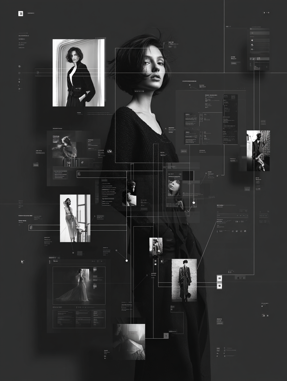
Black Label, Cosmo prof’s design system, had grown bloated and inconsistent. Variables were non-existent, components had too many variants, and documentation could be better.
Designers, developers, and even the marketing team were speaking different languages, which created mismatches across digital experiences.
I saw an opportunity to simplify, streamline, and modernize the system—welsome to a design system glow-up story.
This story is divided into four short chapters:
+ Foundational Variables & Tokens
+ Smarter Typography System
+ Component Optimization
+ Documentation, Training, & Adoption
00.

In case You’re Wondering...

There is a chance you stumbled on this case study and have not the slightest clue what a design system is. No worries, I got your back.
Basically, a design system is like a playlist for your product. It keeps every button, color, and text style in rhythm so the experience feels cohesive—not like three songs playing at once. Technically, it’s reusable components, tokens, and rules that help designers, developers, and anyone on your team stay on beat and move faster.
Design tokens are like the lyrics of your product’s playlist—the smallest, repeatable pieces (colors, spacing, typography values) that everyone follows so we’re all singing the same song. Instead of hard-coding “#121212” or “16px” in a dozen places, tokens store those decisions in one spot and translate them across platforms.
Think of them as the single source of truth for design decisions. Change the lyric once, and every verse (or in our case, every button, header, and background) updates in harmony.
01.

Foundational Variables & Tokens
When I first jumped into Black Label, I didn’t immediately notice that we had zero variables. To be fair, Figma had just launched them, and for most of the team they were still this mysterious black box. So, I decided to crack it open. I dove in and got us started with the basics: primitive variables for colors, spacing, border weights, etc..
It wasn’t glamorous work—it was foundational. Like laying the plumbing in a house before you pick out the fancy fixtures, without it, we had no foundation. Suddenly, instead of six “almost-blacks” or guessing which 8px spacing was the spacing, we had a single source of truth. Primitive, yes—but game-changing.
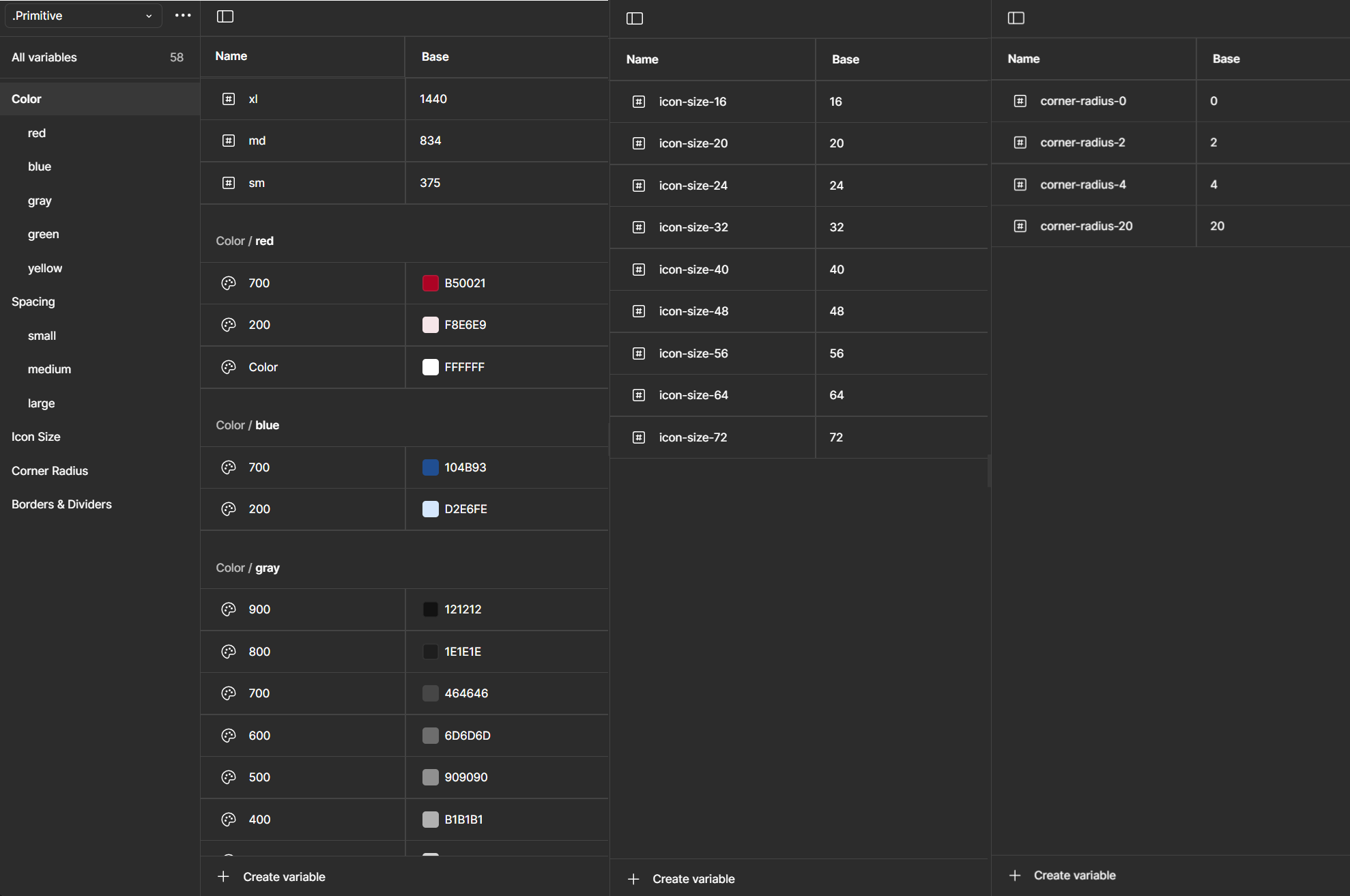
Semantic variables are like nicknames for design tokens.
Instead of calling something #64FF87, you call it Success Green. Instead of #FF6E7B, you call it Error Red.
The actual hex value can change (light mode, dark mode, brand refresh, etc.), but the meaning—“this color = success”—stays the same. Designers just pick the intent, and the system handles the rest.
Leveraging Semantic Variables
I’ll spare you the play-by-play of how I mapped primitives like gray-200 to semantic variables like Medium Gray (yes, I did that, one by one). No one needs a love letter to hex codes. What’s more interesting are the creative but simple ways I put those semantic variables to work for my team.
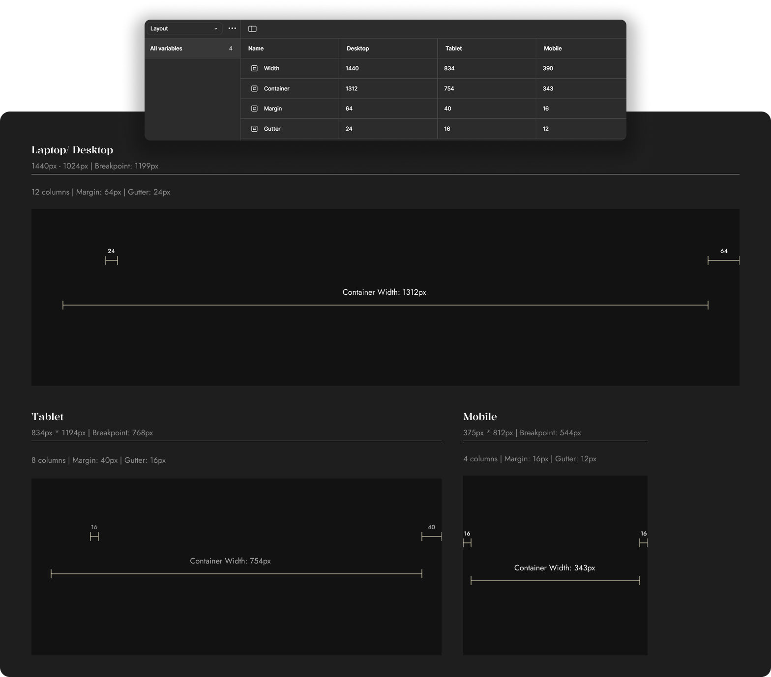
For example: I built a semantic token collection for layout—things like container width and gutter (as pictured below).
These are the kinds of values no one enjoys memorizing (or worse, manually changing across breakpoints). By tying them to semantic tokens, designers (and non-designers) could stop playing “guess the gutter” and just focus on the work. Small, clever tweaks like this don’t make headlines, but they do make life noticeably easier—a true quality-of-life upgrade.
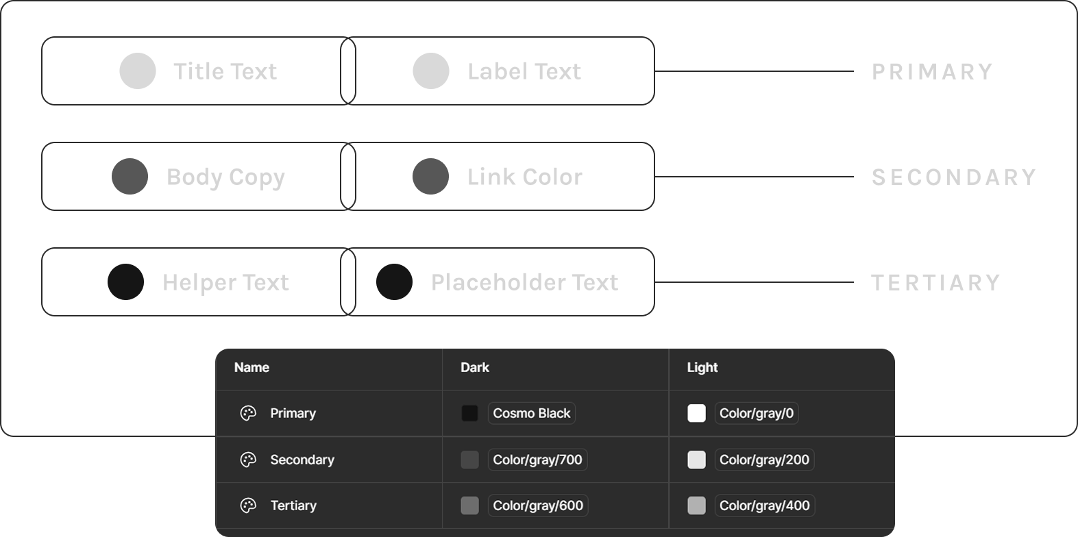
When I arrived at Cosmo Prof, font color styles were a mess—duplicates everywhere and names that didn’t match their actual use. Need a price color? You had to pick “Title Text” and just know it was fine. Not intuitive.
I simplified everything into three semantic levels: Primary, Secondary, and Tertiary. Clear, predictable, and flexible enough to swap between light and dark mode with a single dropdown. The chaos became clean, and designers stopped playing “guess that hex.”
02.

Smarter Typography System
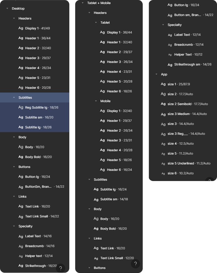
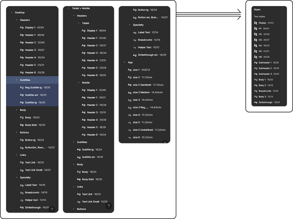
Here’s what our old Design System font styles looked like: the same style name duplicated across every breakpoint—Display, H1, Sub header 3, and on and on. Designers had to scroll through nearly seventy styles just to pick the right one. Dizzying. And if it’s painful for designers, imagine the marketing team trying to learn (or even want to use) the system. Talk about cognitive overload.
The bigger issue? Components needed separate variants at every breakpoint just to handle font-size scaling. Necessary? Not really.
I took the values for font-size, line-height, font-weight, and even font family from the back-end variable table and plugged them into a single set of font styles on the front end.
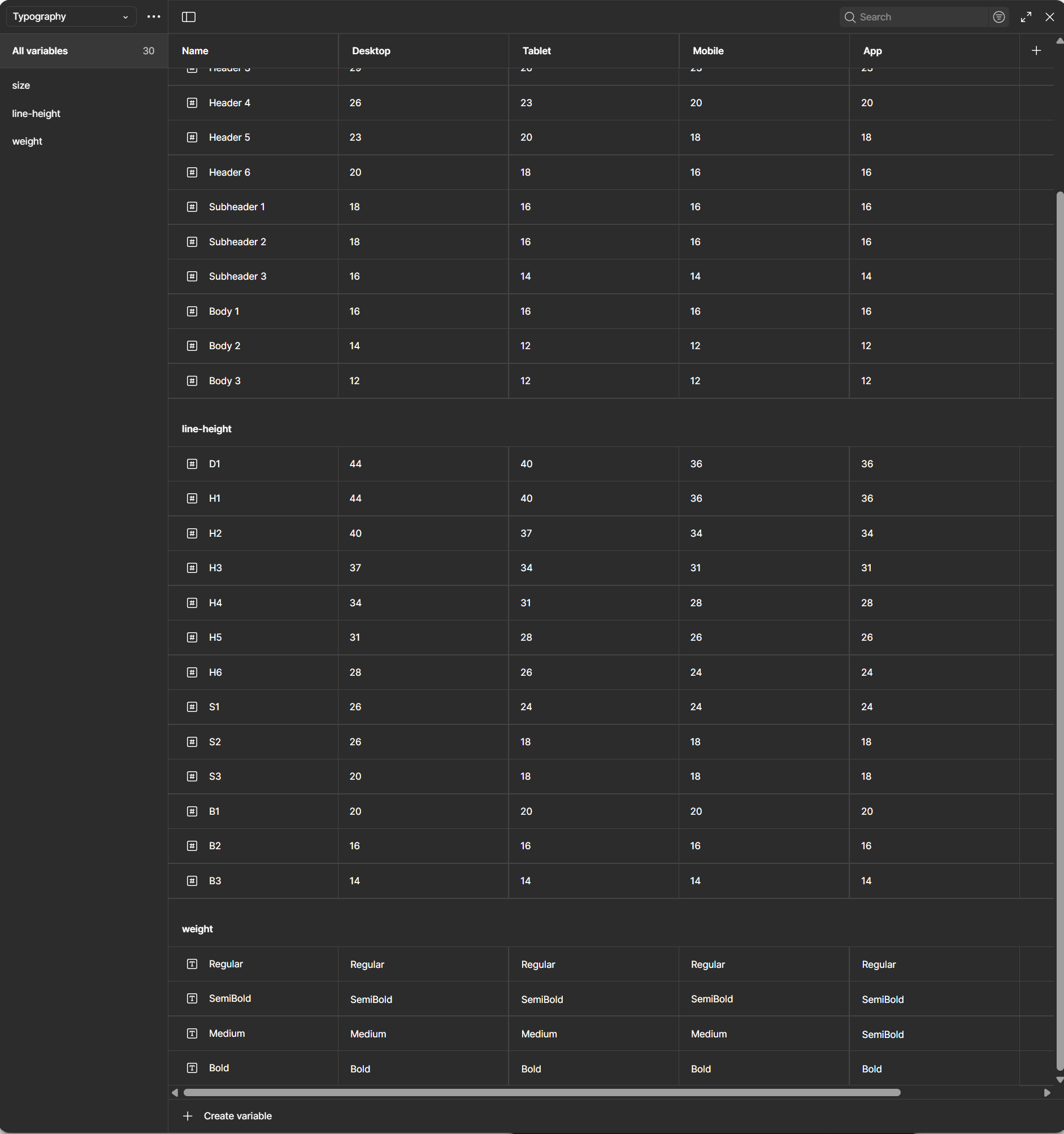

That variable table you see above might look complicated, but it actually slashed the ridiculous number of font styles our team used to juggle. No more cognitive overload, no more endless scrolling. Now it’s cleaner, easier to teach, and way less intimidating—for designers, developers, marketing, and even business folks. Honestly, it blew my mind how simple it became—and I hope it does the same for you.
03.

Component Optimization
Guess what? Smarter typography means smarter components. As I stated above, some component variants existed solely to compensate for font-size scaling across device types. Typography variables meant that that practice wa snow a thing of the past. All I have to do is switch teh mode from Desktop to mobile and every componet on an entire page would consume the change.Using thsi method along with a couple more variables I was able to transform components like the “Fulfillment Tiles” into a much leaner and more efficient build.
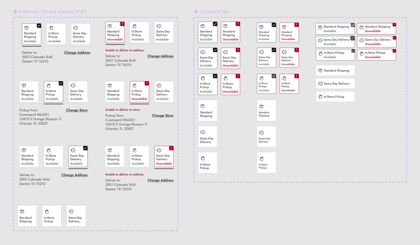
Before
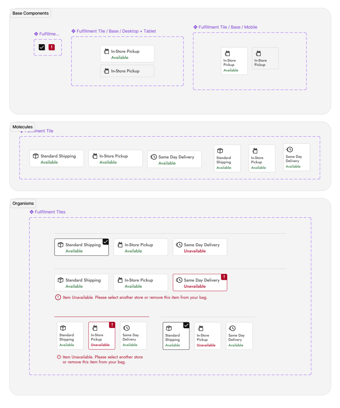
After
I introduced the team to base components—the foundation blocks that feed into larger, master components. By combining this with Figma’s nested properties, a single change at the base level could cascade across the system. The result? Leaner components, fewer variants, and a design system that actually behaved like a system instead of a patchwork.
Using Brad Frost’s Atomic Design methodology, made our builds cleaner and more controllable than ever.
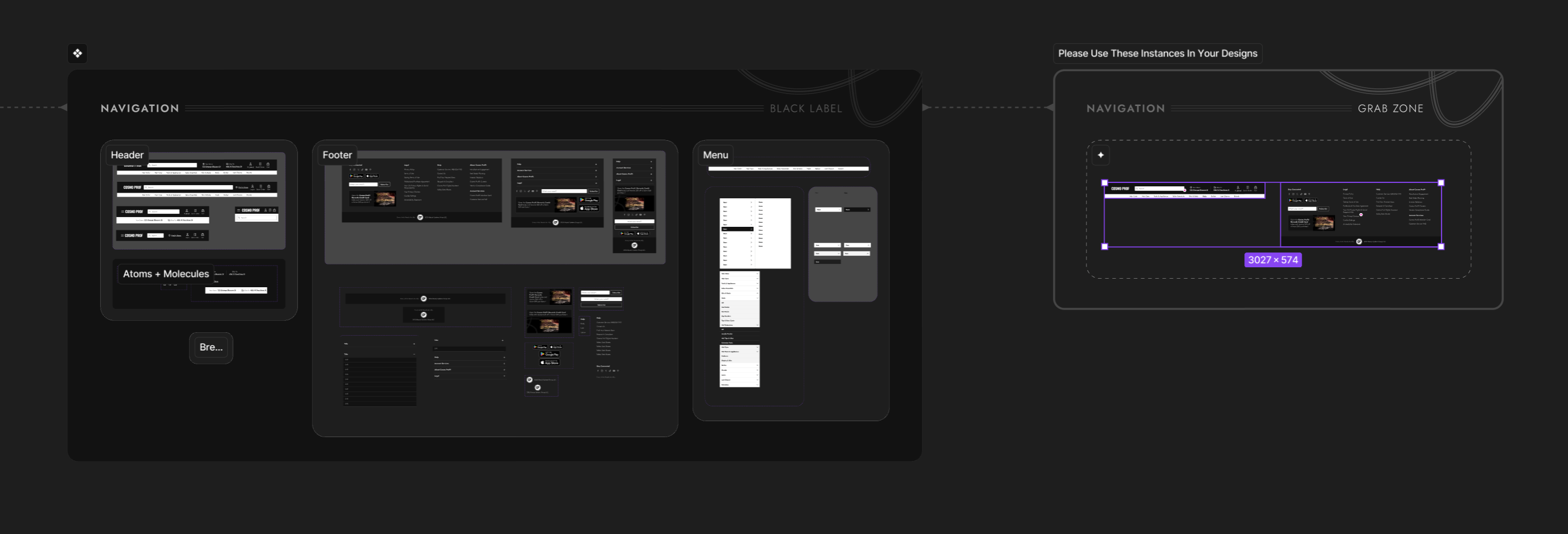
I had a special position amongst my fellow designers - I was the Design System gatekeeper. Governance for a design system is extremely important. One technique I implemented to keep things safe was something I made up called a “Grab Zone.”
Its a dedicated canvas where designers could pull safe-to-use component instances, ensuring master components stayed untouched and consistent.
04.

Beautiful builds mean nothing without buy-in.
Remember, a design system is like a playlist—it only works if everyone’s listening to the same music. Not just the Figma power-users who built the system, but the marketing lead with limited design chops, the product owner writing stories for devs, and the e-commerce team running promos. Everyone needs to not only understand how to use the system, but actually want to hit play.
Because a true design system isn’t just a beautiful technical build—it’s about people, adoption, and making sure the whole team is vibing to the same track.
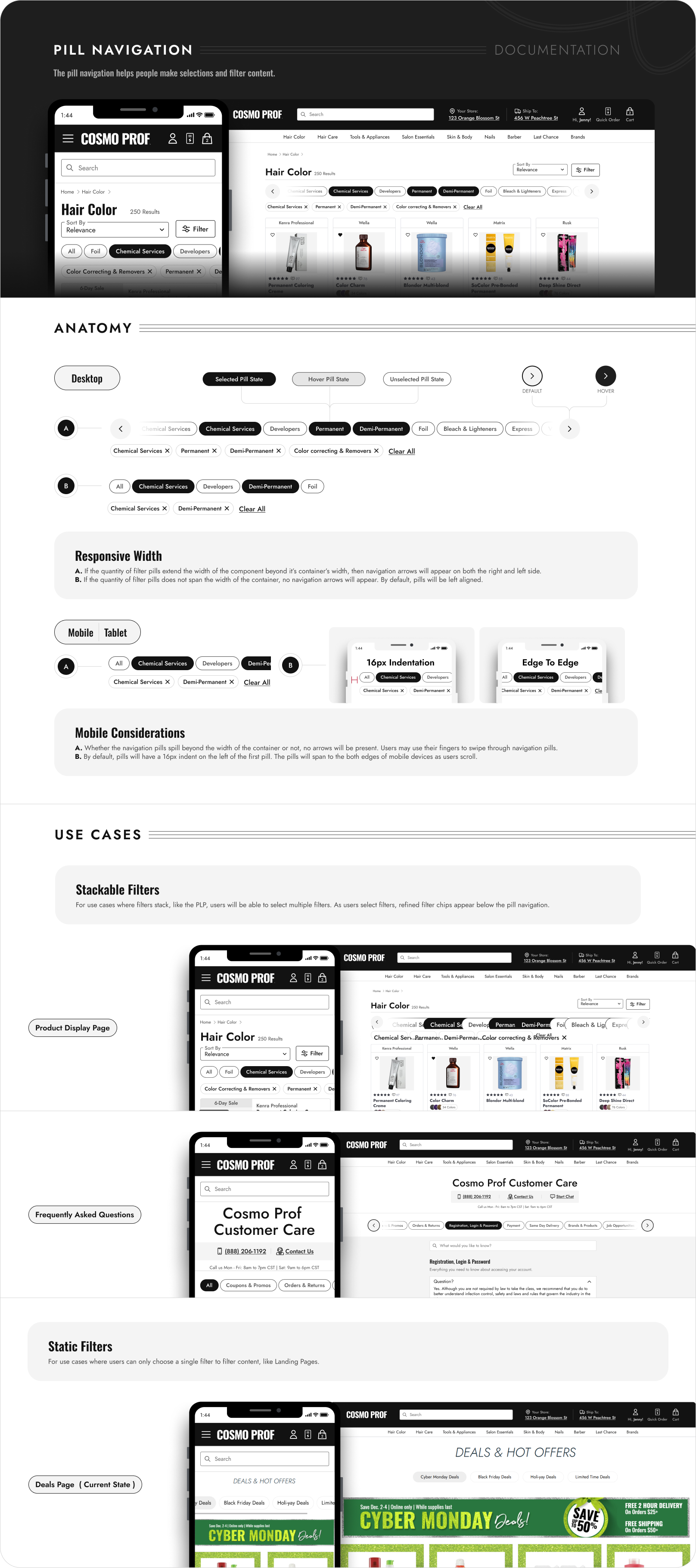
I set out to make component documentation clearer and easier to digest by breaking down the anatomy of each component a bit further and showing real-world use cases more explicitly.
Here’s an example of the refreshed documentation I created for Pill Navigation.

The marketing team was in the middle of a big shift—moving from Photoshop to Figma. To help them succeed (and keep their work aligned with Black Label), I used a healthy mix of structured training sessions and bite-sized teachable moments.
In our dedicated sessions, I walked them through the basics of Figma and the fundamentals of our design system. But the real magic happened in the day-to-day: when they built something rough in Figma, I’d use it as a teachable moment—refining their components, explaining why it worked a certain way, and then folding the polished version back into the system for cross-team reuse.
Our training sessions were more like therapy sessions.
This approach made training consumable, approachable, and less intimidating. I wasn’t the “design system cop,” I was their partner. Over time, the marketing team became confident in Figma, their work began to naturally align with the system, and Black Label grew stronger with contributions that worked across all teams.
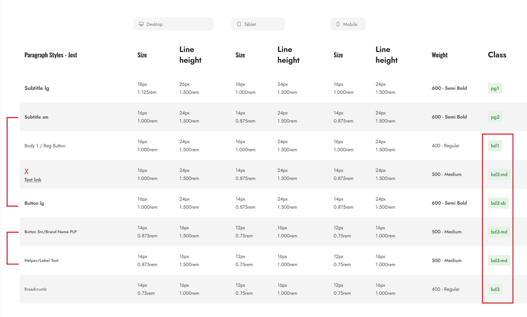
I began to work with the Development team manager to make sure our design tokens and variables didn’t just make sense in Figma, but also matched what lived in code. That meant aligning certain naming conventions, cutting down on duplicates we hadn’t noticed, and creating a cleaner one-to-one relationship between design and development.For example, in the above example, development pointed out to me that “Button Sm” and “Helper/Label Text” shared the same values and should even share the same Class - “bd3-md.”
05.


Design systems aren’t just about components—they’re about enabling people. By simplifying complexity and creating scalable rules, Black Label became more than a library; it became a shared language across teams.
Scalability
Base components and cascading updates made the system future-proof for new features and platforms.
Consistency
Standardized tokens and variables reduced “rogue” colors and text styles
Efficiency
Designers, developers, and marketers all spoke the same language, increasing adoption and reducing errors.
Collaboration
Fewer variants and leaner components meant faster design and easier maintenance.


Available for work
Design Tokens, Therapy Sessions, and the Black Label Makeover
Black Label, Cosmo prof’s design system, had grown bloated and inconsistent. Variables were non-existent, components had too many variants, and documentation could be better.
Designers, developers, and even the marketing team were speaking different languages, which created mismatches across digital experiences.
I saw an opportunity to simplify, streamline, and modernize the system—welsome to a design system glow-up story.
This story is divided into four short chapters:
+ Foundational Variables & Tokens
+ Smarter Typography System
+ Component Optimization
+ Documentation, Training, & Adoption
00.

In case You’re Wondering...
There is a chance you stumbled on this case study and have not the slightest clue what a design system is. No worries, I got your back.
Basically, a design system is like a playlist for your product. It keeps every button, color, and text style in rhythm so the experience feels cohesive—not like three songs playing at once. Technically, it’s reusable components, tokens, and rules that help designers, developers, and anyone on your team stay on beat and move faster.
Design tokens are like the lyrics of your product’s playlist—the smallest, repeatable pieces (colors, spacing, typography values) that everyone follows so we’re all singing the same song. Instead of hard-coding “#121212” or “16px” in a dozen places, tokens store those decisions in one spot and translate them across platforms.
Think of them as the single source of truth for design decisions. Change the lyric once, and every verse (or in our case, every button, header, and background) updates in harmony.
01.

Foundational Variables & Tokens
When I first jumped into Black Label, I didn’t immediately notice that we had zero variables. To be fair, Figma had just launched them, and for most of the team they were still this mysterious black box. So, I decided to crack it open. I dove in and got us started with the basics: primitive variables for colors, spacing, border weights, etc..
It wasn’t glamorous work—it was foundational. Like laying the plumbing in a house before you pick out the fancy fixtures, without it, we had no foundation. Suddenly, instead of six “almost-blacks” or guessing which 8px spacing was the spacing, we had a single source of truth. Primitive, yes—but game-changing.
Semantic variables are like nicknames for design tokens.
Instead of calling something #64FF87, you call it Success Green. Instead of #FF6E7B, you call it Error Red.
The actual hex value can change (light mode, dark mode, brand refresh, etc.), but the meaning—“this color = success”—stays the same. Designers just pick the intent, and the system handles the rest.
Leveraging Semantic Variables
I’ll spare you the play-by-play of how I mapped primitives like gray-200 to semantic variables like Medium Gray (yes, I did that, one by one). No one needs a love letter to hex codes. What’s more interesting are the creative but simple ways I put those semantic variables to work for my team.
For example: I built a semantic token collection for layout—things like container width and gutter (as pictured below).
These are the kinds of values no one enjoys memorizing (or worse, manually changing across breakpoints). By tying them to semantic tokens, designers (and non-designers) could stop playing “guess the gutter” and just focus on the work. Small, clever tweaks like this don’t make headlines, but they do make life noticeably easier—a true quality-of-life upgrade.
When I arrived at Cosmo Prof, font color styles were a mess—duplicates everywhere and names that didn’t match their actual use. Need a price color? You had to pick “Title Text” and just know it was fine. Not intuitive.
I simplified everything into three semantic levels: Primary, Secondary, and Tertiary. Clear, predictable, and flexible enough to swap between light and dark mode with a single dropdown. The chaos became clean, and designers stopped playing “guess that hex.”
02.

Smarter Typography System
Here’s what our old Design System font styles looked like: the same style name duplicated across every breakpoint—Display, H1, Sub header 3, and on and on. Designers had to scroll through nearly seventy styles just to pick the right one. Dizzying. And if it’s painful for designers, imagine the marketing team trying to learn (or even want to use) the system. Talk about cognitive overload.
The bigger issue? Components needed separate variants at every breakpoint just to handle font-size scaling. Necessary? Not really.
I took the values for font-size, line-height, font-weight, and even font family from the back-end variable table and plugged them into a single set of font styles on the front end.
That variable table you see above might look complicated, but it actually slashed the ridiculous number of font styles our team used to juggle. No more cognitive overload, no more endless scrolling. Now it’s cleaner, easier to teach, and way less intimidating—for designers, developers, marketing, and even business folks. Honestly, it blew my mind how simple it became—and I hope it does the same for you.
03.

Component Optimization
Guess what? Smarter typography means smarter components. As I stated above, some component variants existed solely to compensate for font-size scaling across device types. Typography variables meant that that practice wa snow a thing of the past. All I have to do is switch teh mode from Desktop to mobile and every componet on an entire page would consume the change.Using thsi method along with a couple more variables I was able to transform components like the “Fulfillment Tiles” into a much leaner and more efficient build.
Before
After
I introduced the team to base components—the foundation blocks that feed into larger, master components. By combining this with Figma’s nested properties, a single change at the base level could cascade across the system. The result? Leaner components, fewer variants, and a design system that actually behaved like a system instead of a patchwork.
Using Brad Frost’s Atomic Design methodology, made our builds cleaner and more controllable than ever.
I had a special position amongst my fellow designers - I was the Design System gatekeeper. Governance for a design system is extremely important. One technique I implemented to keep things safe was something I made up called a “Grab Zone.”
Its a dedicated canvas where designers could pull safe-to-use component instances, ensuring master components stayed untouched and consistent.
04.

Beautiful builds mean nothing without buy-in.
Remember, a design system is like a playlist—it only works if everyone’s listening to the same music. Not just the Figma power-users who built the system, but the marketing lead with limited design chops, the product owner writing stories for devs, and the e-commerce team running promos. Everyone needs to not only understand how to use the system, but actually want to hit play.
Because a true design system isn’t just a beautiful technical build—it’s about people, adoption, and making sure the whole team is vibing to the same track.
I set out to make component documentation clearer and easier to digest by breaking down the anatomy of each component a bit further and showing real-world use cases more explicitly.
Here’s an example of the refreshed documentation I created for Pill Navigation.
The marketing team was in the middle of a big shift—moving from Photoshop to Figma. To help them succeed (and keep their work aligned with Black Label), I used a healthy mix of structured training sessions and bite-sized teachable moments.
In our dedicated sessions, I walked them through the basics of Figma and the fundamentals of our design system. But the real magic happened in the day-to-day: when they built something rough in Figma, I’d use it as a teachable moment—refining their components, explaining why it worked a certain way, and then folding the polished version back into the system for cross-team reuse.
Our training sessions were more like therapy sessions.
This approach made training consumable, approachable, and less intimidating. I wasn’t the “design system cop,” I was their partner. Over time, the marketing team became confident in Figma, their work began to naturally align with the system, and Black Label grew stronger with contributions that worked across all teams.
I began to work with the Development team manager to make sure our design tokens and variables didn’t just make sense in Figma, but also matched what lived in code. That meant aligning certain naming conventions, cutting down on duplicates we hadn’t noticed, and creating a cleaner one-to-one relationship between design and development.For example, in the above example, development pointed out to me that “Button Sm” and “Helper/Label Text” shared the same values and should even share the same Class - “bd3-md.”
05.

Design systems aren’t just about components—they’re about enabling people. By simplifying complexity and creating scalable rules, Black Label became more than a library; it became a shared language across teams.
Consistency
Standardized tokens and variables reduced “rogue” colors and text styles
Collaboration
Fewer variants and leaner components meant faster design and easier maintenance.
Scalability
Base components and cascading updates made the system future-proof for new features and platforms.
Efficiency
Designers, developers, and marketers all spoke the same language, increasing adoption and reducing errors.


Available for work
Design Tokens, Therapy Sessions, and the Black Label Makeover
Black Label, Cosmo Prof’s design system, had grown bloated and inconsistent. Variables were non-existent, components had too many variants, and documentation could be better.
Designers, developers, and even the marketing team were speaking different languages, which created mismatches across digital experiences.
I saw an opportunity to simplify, streamline, and modernize the system—welcome to a design system glow-up story.
This story is divided into four short chapters:
+ Foundational Variables & Tokens
+ Smarter Typography System
+ Component Optimization
+ Documentation, Training, & Adoption
00.

In case You’re Wondering...
There is a chance you stumbled on this case study and have not the slightest clue what a design system is. No worries, I got your back.
Basically, a design system is like a playlist for your product. It keeps every button, color, and text style in rhythm so the experience feels cohesive—not like three songs playing at once. Technically, it’s reusable components, tokens, and rules that help designers, developers, and anyone on your team stay on beat and move faster.
Design tokens are like the lyrics of your product’s playlist—the smallest, repeatable pieces (colors, spacing, typography values) that everyone follows so we’re all singing the same song. Instead of hard-coding “#121212” or “16px” in a dozen places, tokens store those decisions in one spot and translate them across platforms.
Think of them as the single source of truth for design decisions. Change the lyric once, and every verse (or in our case, every button, header, and background) updates in harmony.
01.

Foundational Variables & Tokens
When I first jumped into Black Label, I didn’t immediately notice that we had zero variables. To be fair, Figma had just launched them, and for most of the team they were still this mysterious black box. So, I decided to crack it open. I dove in and got us started with the basics: primitive variables for colors, spacing, border weights, etc..
It wasn’t glamorous work—it was foundational. Like laying the plumbing in a house before you pick out the fancy fixtures, without it, we had no foundation. Suddenly, instead of six “almost-blacks” or guessing which 8px spacing was the spacing, we had a single source of truth. Primitive, yes—but game-changing.
Semantic variables are like nicknames for design tokens.
Instead of calling something #64FF87, you call it Success Green. Instead of #FF6E7B, you call it Error Red.
The actual hex value can change (light mode, dark mode, brand refresh, etc.), but the meaning—“this color = success”—stays the same. Designers just pick the intent, and the system handles the rest.
Leveraging Semantic Variables
I’ll spare you the play-by-play of how I mapped primitives like gray-200 to semantic variables like Medium Gray (yes, I did that, one by one). No one needs a love letter to hex codes. What’s more interesting are the creative but simple ways I put those semantic variables to work for my team.
For example: I built a semantic token collection for layout—things like container width and gutter (as pictured below).
These are the kinds of values no one enjoys memorizing (or worse, manually changing across breakpoints). By tying them to semantic tokens, designers (and non-designers) could stop playing “guess the gutter” and just focus on the work. Small, clever tweaks like this don’t make headlines, but they do make life noticeably easier—a true quality-of-life upgrade.
When I arrived at Cosmo Prof, font color styles were a mess—duplicates everywhere and names that didn’t match their actual use. Need a price color? You had to pick “Title Text” and just know it was fine. Not intuitive.
I simplified everything into three semantic levels: Primary, Secondary, and Tertiary. Clear, predictable, and flexible enough to swap between light and dark mode with a single dropdown. The chaos became clean, and designers stopped playing “guess that hex.”
02.

Smarter Typography System
Here’s what our old Design System font styles looked like: the same style name duplicated across every breakpoint—Display, H1, Sub header 3, and on and on. Designers had to scroll through nearly seventy styles just to pick the right one. Dizzying. And if it’s painful for designers, imagine the marketing team trying to learn (or even want to use) the system. Talk about cognitive overload.
The bigger issue? Components needed separate variants at every breakpoint just to handle font-size scaling. Necessary? Not really.
I took the values for font-size, line-height, font-weight, and even font family from the back-end variable table and plugged them into a single set of font styles on the front end.
That variable table you see above might look complicated, but it actually slashed the ridiculous number of font styles our team used to juggle. No more cognitive overload, no more endless scrolling. Now it’s cleaner, easier to teach, and way less intimidating—for designers, developers, marketing, and even business folks. Honestly, it blew my mind how simple it became—and I hope it does the same for you.
03.

Component Optimization
Guess what? Smarter typography = smarter components. Before, we had entire component variants that existed for one reason only: font-size scaling across devices. With typography variables, that headache vanished. Now, I can flip a frame from Desktop to Mobile and watch every component on the page instantly adapt.
Pairing this with a few other variables, I rebuilt components like the Fulfillment Tiles into leaner, cleaner, and far more efficient versions of themselves. Less bloat, more brains.
Before
After
I introduced the team to base components—the foundation blocks that feed into larger, master components. By combining this with Figma’s nested properties, a single change at the base level could cascade across the system. The result? Leaner components, fewer variants, and a design system that actually behaved like a system instead of a patchwork.
Using Brad Frost’s Atomic Design methodology, made our builds cleaner and more controllable than ever.
I had a special position amongst my fellow designers - I was the Design System gatekeeper. Governance for a design system is extremely important. One technique I implemented to keep things safe was something I made up called a “Grab Zone.”
Its a dedicated canvas where designers could pull safe-to-use component instances, ensuring master components stayed untouched and consistent.
04.

Beautiful builds mean nothing without buy-in.
Remember, a design system is like a playlist—it only works if everyone’s listening to the same music. Not just the Figma power-users who built the system, but the marketing lead with limited design chops, the product owner writing stories for devs, and the e-commerce team running promos. Everyone needs to not only understand how to use the system, but actually want to hit play.
Because a true design system isn’t just a beautiful technical build—it’s about people, adoption, and making sure the whole team is vibing to the same track.
I set out to make component documentation clearer and easier to digest by breaking down the anatomy of each component a bit further and showing real-world use cases more explicitly.
Here’s an example of the refreshed documentation I created for Pill Navigation.
The marketing team was in the middle of a big shift—moving from Photoshop to Figma. To help them succeed (and keep their work aligned with Black Label), I used a healthy mix of structured training sessions and bite-sized teachable moments.
In our dedicated sessions, I walked them through the basics of Figma and the fundamentals of our design system. But the real magic happened in the day-to-day: when they built something rough in Figma, I’d use it as a teachable moment—refining their components, explaining why it worked a certain way, and then folding the polished version back into the system for cross-team reuse.
Our training sessions were more like therapy sessions.
This approach made training consumable, approachable, and less intimidating. I wasn’t the “design system cop,” I was their partner. Over time, the marketing team became confident in Figma, their work began to naturally align with the system, and Black Label grew stronger with contributions that worked across all teams.
I began to work with the Development team manager to make sure our design tokens and variables didn’t just make sense in Figma, but also matched what lived in code. That meant aligning certain naming conventions, cutting down on duplicates we hadn’t noticed, and creating a cleaner one-to-one relationship between design and development.For example, in the above example, development pointed out to me that “Button Sm” and “Helper/Label Text” shared the same values and should even share the same Class - “bd3-md.”
05.

Design systems aren’t just about components—they’re about enabling people. By simplifying complexity and creating scalable rules, Black Label became more than a library; it became a shared language across teams.
Consistency
Standardized tokens and variables reduced “rogue” colors and text styles
Collaboration
Fewer variants and leaner components meant faster design and easier maintenance.
Scalability
Base components and cascading updates made the system future-proof for new features and platforms.
Efficiency
Designers, developers, and marketers all spoke the same language, increasing adoption and reducing errors.


How I decreased cart abandonment by 54%
view case study
↗
How I increased the average order value (AOV) by 33%
view case study
↗